Executive sales for Tailwind Traders(2024)

For a detailed view of the code, check out the GitHub repository:
View the Code on GitHub
Go Back To Menu
Executive Sales Analysis
This project involved preparing and configuring data for analysis, designing and developing a data model, configuring aggregations using DAX, creating sales and profit reports, and finally creating an executive dashboard with alerts and subscriptions.
Milestone 1: Data Preparation and Model Development
Prepare the Sales Excel Data
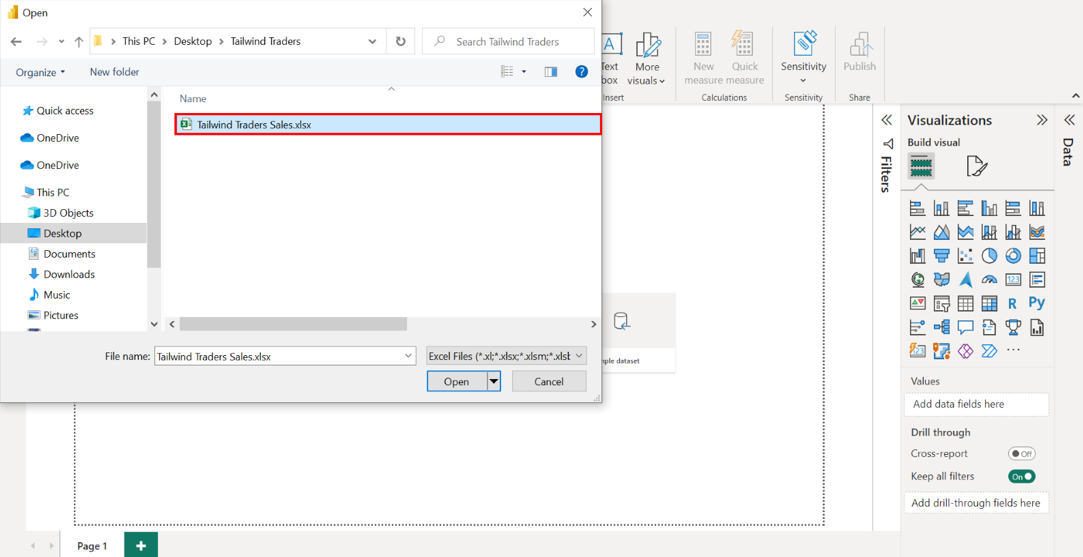
Step 1: Download the file and open the Sales worksheet from the Excel workbook.
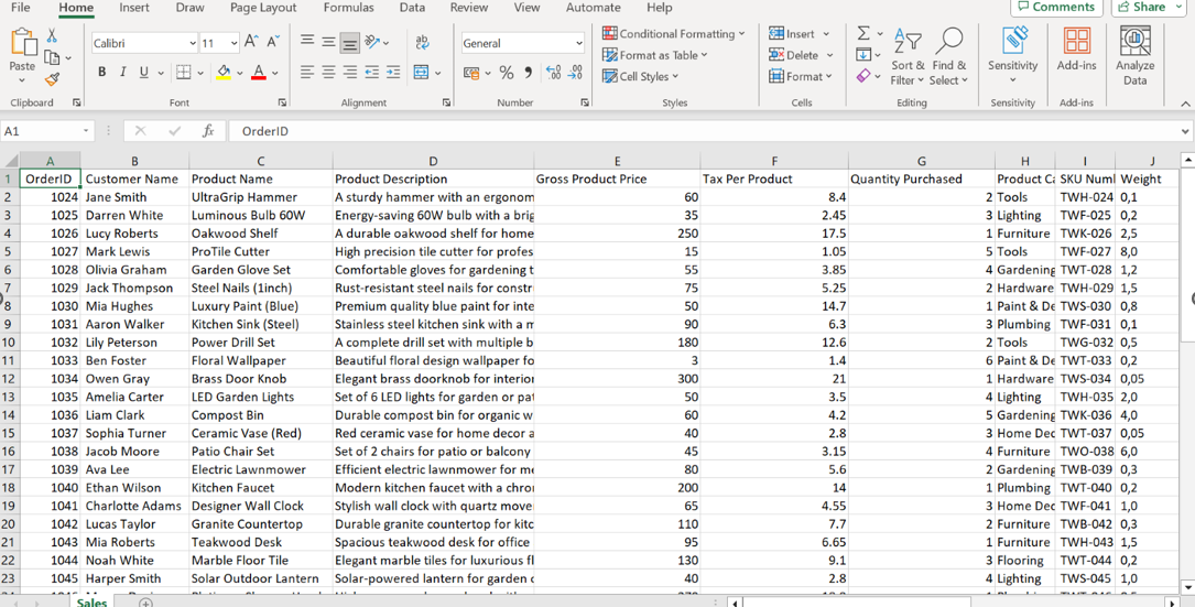
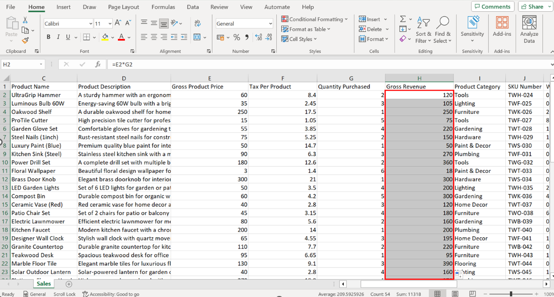
Step 2: Calculate Gross Revenue by inserting a new column and using the formula =E2*G2.
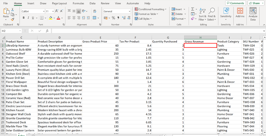
Select the first cell under the Gross Revenue column. Enter the formula =E2*G2 and press Enter to apply the formula to this first cell.
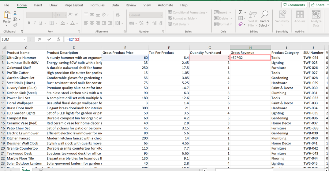
Then, using either the fill handle or the double-click shortcut, extend the formula to the entire column to calculate the revenue for each product.
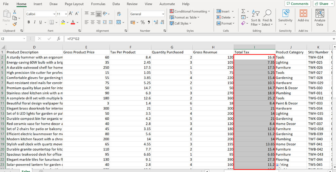
Step 3: Calculate Total Tax using the formula =F2*G2.
Create a Total Tax column next to Gross Revenue. Insert a new column to the right of Gross Revenue and label it Total Tax.
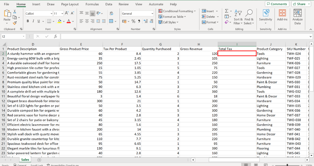
Select the first cell under Total Tax. Input the formula =F2*G2 and press Enter to confirm the formula.
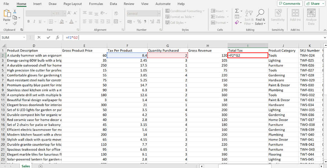
Drag down or double-click the fill handle to copy the formula down the column, calculating the tax for each item.
Step 4: Calculate Net Revenue with the formula =H2-I2.
Insert a Net Revenue column next to Total Tax. Insert a new column to the right of Total Tax and label it Net Revenue. Net Revenue is a critical metric for Tailwind Traders as it reflects the real financial contribution of each product to the company's bottom line.
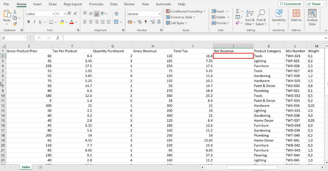
Use the formula =H2-I2 to determine the actual earnings post-tax for each product. In the first cell under Net Revenue, input the formula =H2-I2 and press Enter to compute the net revenue for the first product.
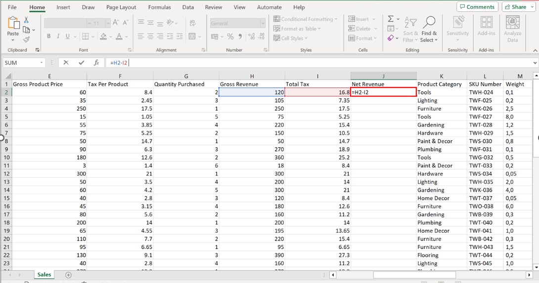
Then, double-click shortcut on cell J2 or drag this formula down to cater to all products on your list. Repeat this action for the formulas in H2 and I2. Drag down or double-click the fill handle to copy the formula down the column, calculating the net revenue for each product.
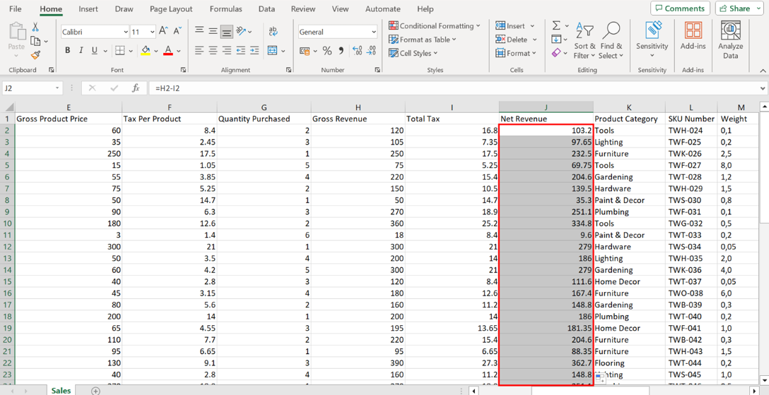
Observe the first ten records and note the highest and lowest values for Net Revenue, Quantity Purchased, and Total Tax. In conjunction, observe neighboring columns like Sales Rep for trends. The product Power Drill Set priced at 334.8USD, is the highest among the first ten listed orders. Floral Wallpaper, priced at 3 USD and with a quantity of 6, generated the lowest net revenue of 9.6 USD.
Observe the first ten records to note the highest and lowest values for Net Revenue, Quantity Purchased, and Total Tax.
Alice, the sales rep, managed sales transactions for the UltraGrip Hammer, Oakwood Shelf, Garden Glove Set, and Kitchen Sink (Steel), making 4 transactions, the most among the listed orders.
Configure Data Sources
Step 1: Load the Sales data into Power BI and transform it in Power Query.
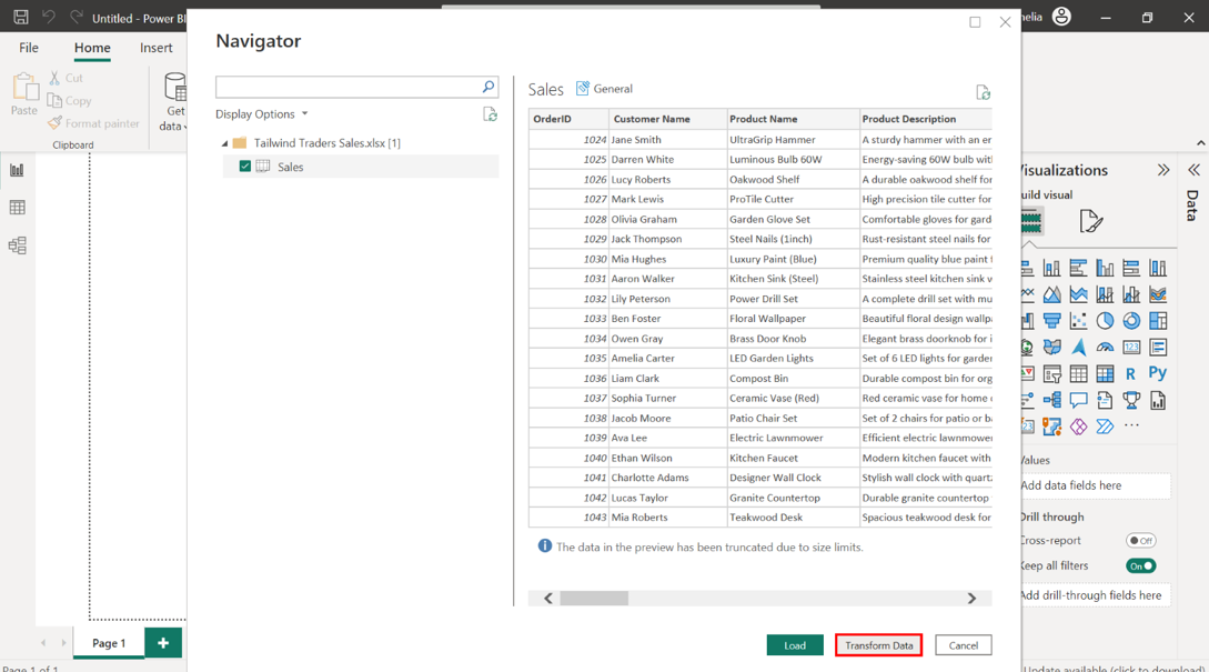
Load the Tailwind Traders Sales file into Power BI and select Transform. Begin by loading the Tailwind Traders Sales data file into Power BI.
Once loaded, select the Transform Data option to enter the Power Query Editor.
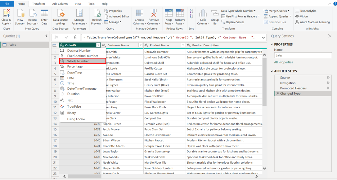
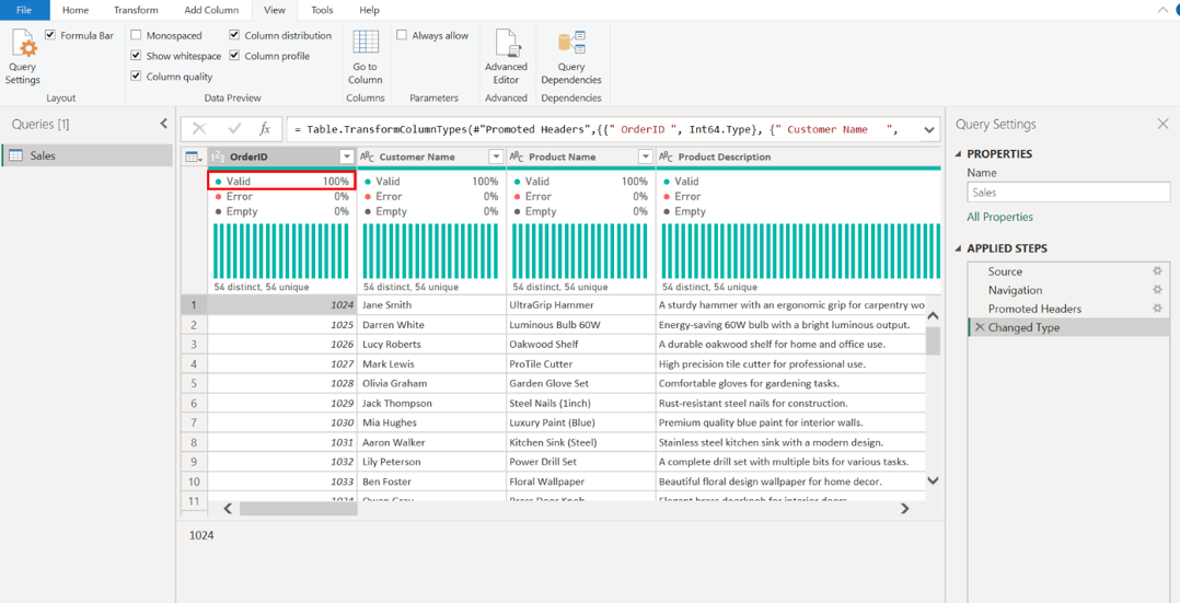
Within Power Query, find the OrderIDcolumn and set the data type to Whole Number. In Power Query, locate the OrderID column and set its data type to Whole Number. This ensures that transactions are treated as unique numeric values, not as text or any other format, which could lead to incorrect sorting or calculations.
To complete optimization, assign the following data types for the columns:
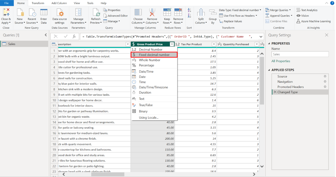
• Gross Product Price = Fixed Decimal Number
• Tax Per Product = Fixed Decimal Number
• Quantity Purchased = Whole Number
• Loyalty Points = Whole Number
• Stock = Whole Number
• Product Category = Text
• Rating = Fixed Decimal Number
Select the title of each column to view the list of available data types. Select the required data type to assign it to its respective column.
In the View tab, upon selecting the Column Quality, Column Distribution, and Column Profile boxes, ensure the Valid percentage is 100% for the OrderID column. Navigate to the View tab. Select the Column Quality, Column Distribution, and Column Profile checkboxes. Examining column quality, distribution, and profiles helps assess the data's health. It also allows for the early detection of issues, saving time and preventing errors in later stages of the analysis.
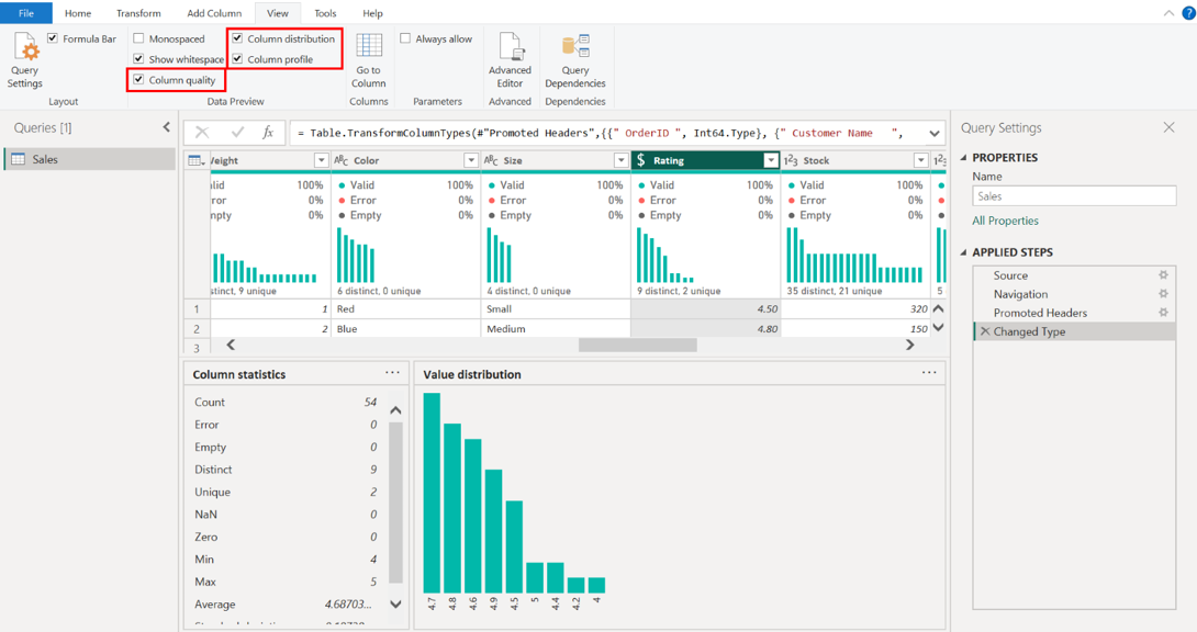
Validate that the OrderID column achieves a 100% Valid rate, reflecting its data integrity. This confirms that there are no nulls, duplicates, or erroneous entries in this crucial column, which is vital for tracking individual sales accurately.
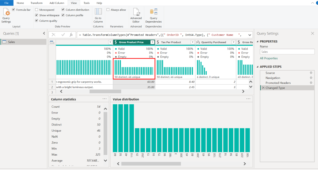
Select the Gross Product Price column and note down the histogram frequency of distinct and unique values. Tailwind Traders offers products at 50 distinct price points for the Gross Product Price column.
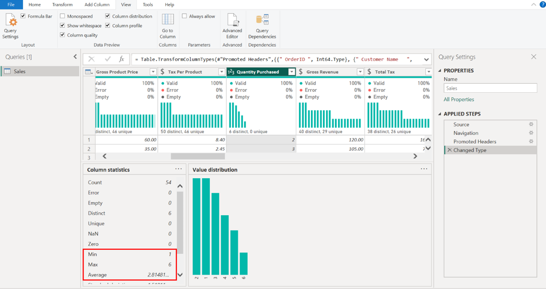
Select the Quantity Purchased column and note down the MIN, MAX and AVERAGE values displayed on the additional statistical pane. In the Quantity Purchased column, the minimum value is 1, the maximum value is 6, and the average value is 2.8148. These statistics are fundamental to understanding sales volumes.
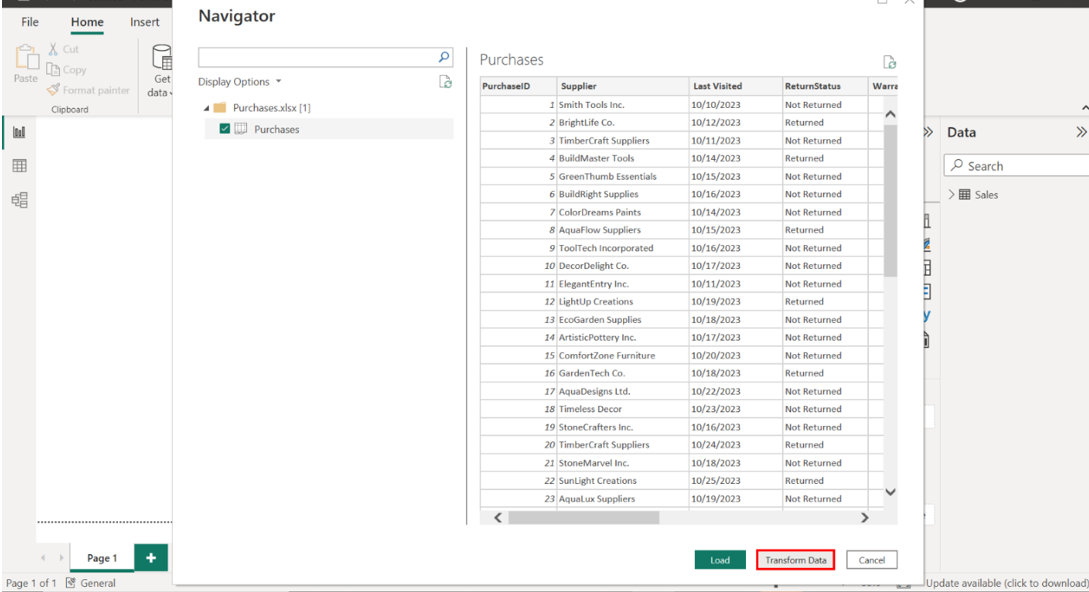
Step 2: Load the Purchases data and configure the columns with appropriate data types.
Select the Purchases data file and then select Load to load it into Power BI. Select Transform Data to access Power Query.
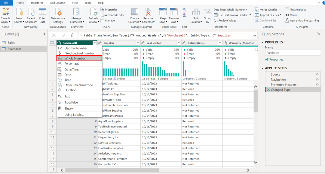
To complete optimization, assign the following data types for the columns:
• PurchaseID = Whole Number
• OrderID = Whole Number
• Return Policy (Days) = Whole Number
• Purchase Date = Date
• Warranty (Months) = Whole Number
• Supplier = Text
• Last Visited = Date
• ReturnStatus = Text
Carefully assign the appropriate data types for each column by selecting the column header and the correct data type from the list.
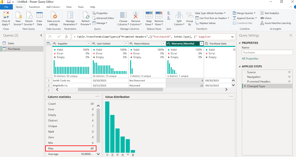
Select the Warranty (Months) column and note down the MIN, MAX and AVERAGE values displayed on the additional statistical pane. Tailwind Traders offers a minimum warranty duration of 6 months, a maximum of 48 months, and an average of 18.88 months.
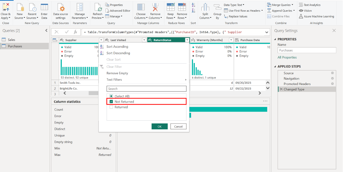
Select the ReturnStatus column and observe the Column Quality pane to ensure the Valid percentage is 100%. Observe the ReturnStatus column and confirm a 100% Valid rate via the Column Quality pane, indicating clean data. This is vital for financial reporting and understanding customer satisfaction.
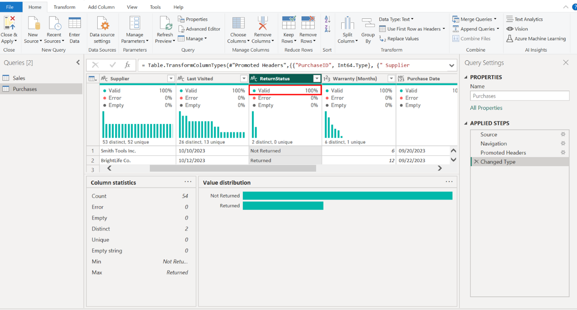
Filter the ReturnStatus column to ensure that only records with Not Returned are visible. Select the ReturnStatus column header to access the filter options. Select Not Returned from the list of filter options to ensure visibility of only those records.
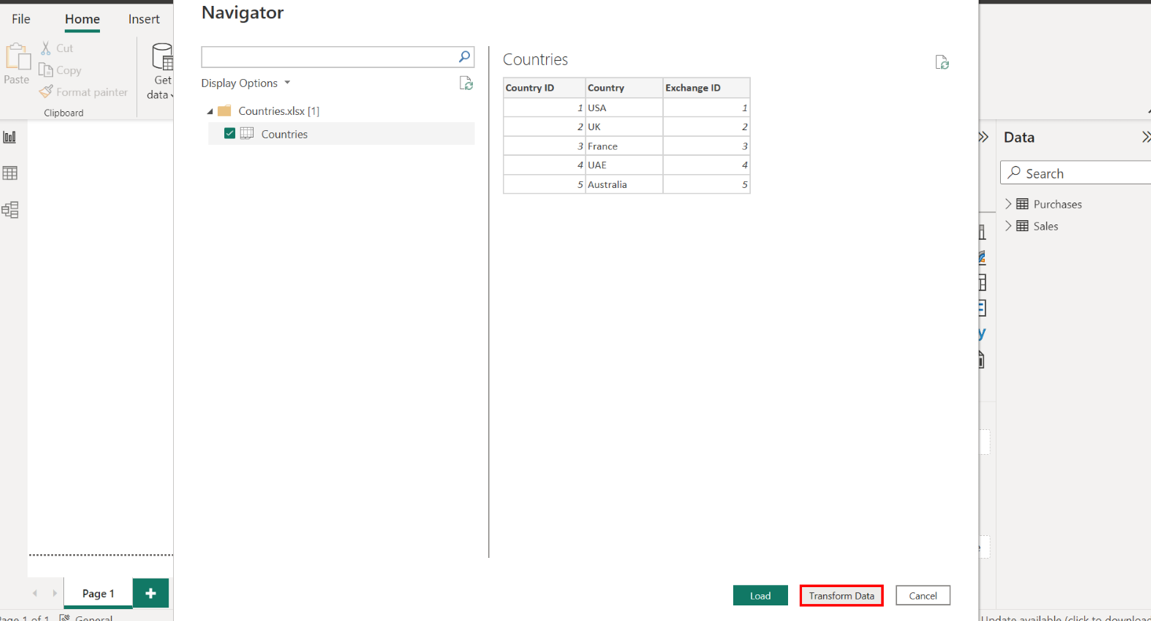
Step 3: Load the Countries data and configure the columns with appropriate data types.
Load the Countries data file into Power BI.Choose Transform Data to access the data manipulation tools in Power Query.
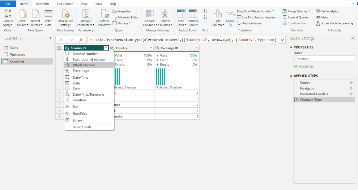
To complete optimization, assign the following data types for the columns:
• Country ID = Whole Number
• Exchange ID = Whole Number
• Country = Text
To assign data types, select each column header to open the list of options. Then, select the correct data type from the list.
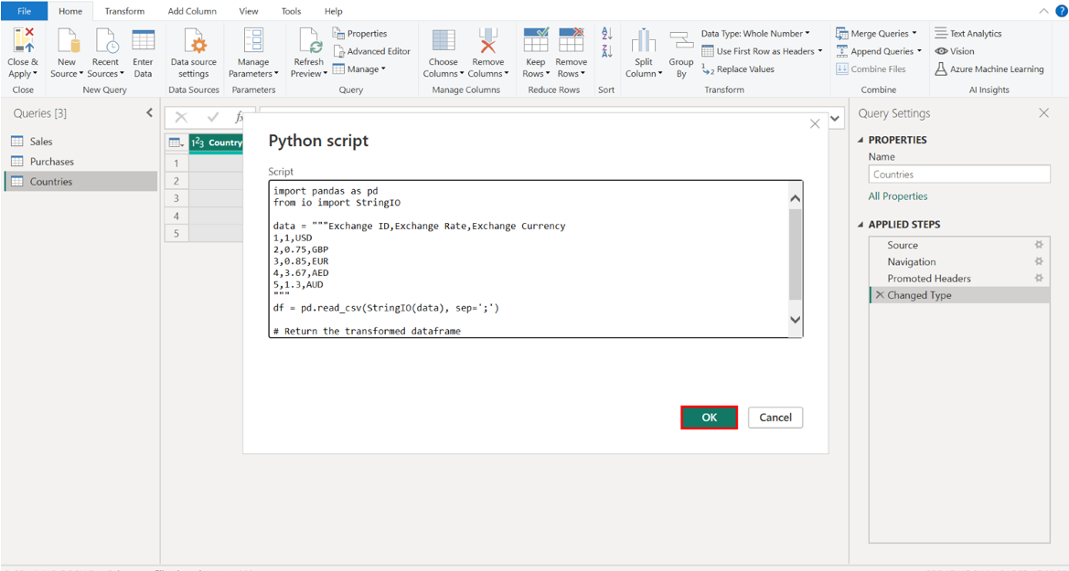
Step 4: Load the Historical Currency Exchange data using a Python script.
Select Get Data, choose Python script, and then paste the following code into the script window in Power BI:
import pandas as pd
from io import StringIO
data = """Exchange ID;ExchangeRate;Exchange Currency
1;1;USD
2;0,75;GBP
3;0,85;EUR
4;3,67;AED
5;1,3;AUD"""
df = pd.read_csv(StringIO(data), sep=';')
# Return the transformed dataframe df
Navigate to Get Data and select the Python script option.
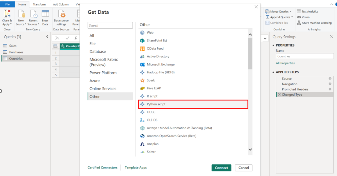
Input the Python code into Power BI’s script window.
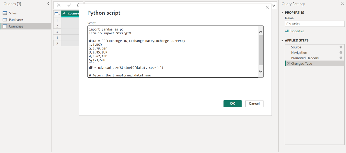
Integrate this data into your Power BI report. Select the OK button to add this data to your Power BI report.
Save the Power BI project as Tailwind Traders Report.pbix.
This captures your progress and solidifies the analytical workflow, allowing for reporting and further analysis continuity.
Step 5: Save the Power BI project as Tailwind Traders Report.pbix.
Design and Develop the Data Model
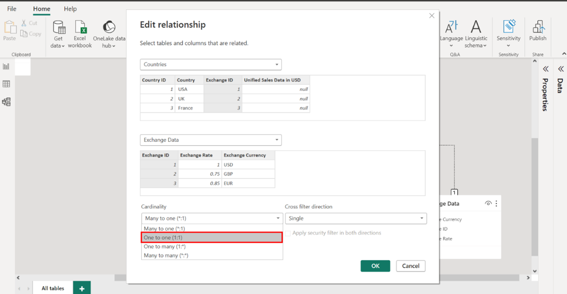
Step 1: Create a relationship between the Countries and Exchange Datatables
Create a relationship between the Countries and Exchange Data tables on the Exchange ID field. Select the Model view option from the left-hand sidebar to view your data model.
Begin by creating a relationship on the Exchange ID field that links the Countries table with the Exchange Data table, which forms the foundation of the currency translation mechanism.
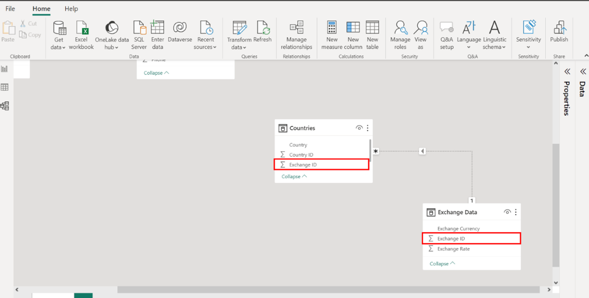
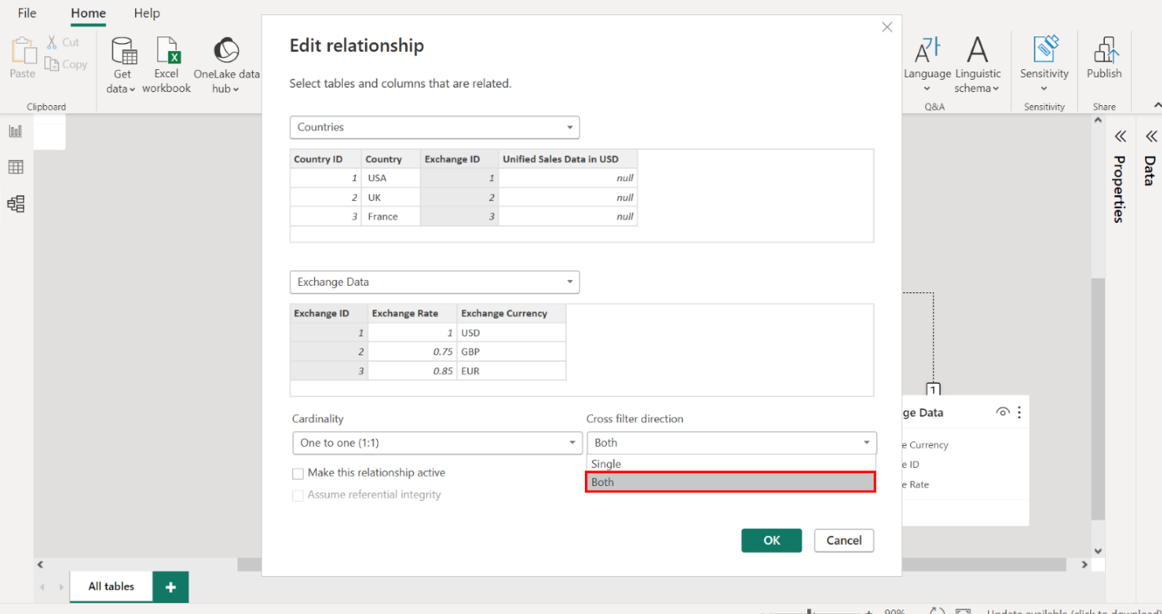
Set the Cardinality to One to One (1:1). Right-click on the relationship that you just created to access the Edit relationship menu. Navigate to the Cardinality options and set the cardinality of this relationship to One to One (1:1).
Set the Cross filter direction to Both to be bi-directional. Navigate to the Cross filter direction options and select Both to enable a bi-directional flow.
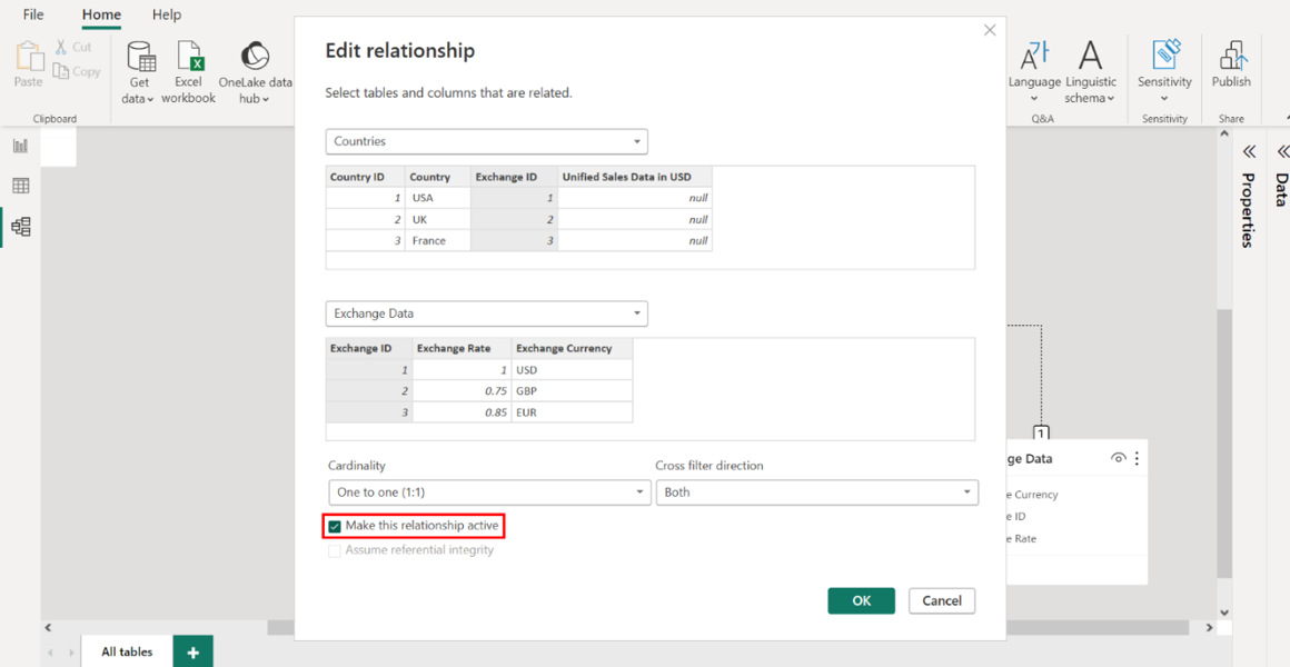
Ensure the Make this relationship active checkbox is selected. Navigate to the Make this relationship active checkbox and confirm it’s checked. Select OK to apply your settings.
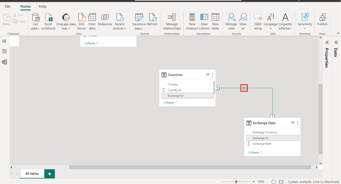
Inspect the relationship arrow in the Model View to ensure the arrows point in both directions and display a 1:1 symbol on either end of the connector.
Once you select OK, Power BI returns to the Model View. To ensure your settings have been enacted as required, check that your model resembles the screenshot below. The relationship arrow between the tables must point both ways, symbolizing a bi-directional link. There should also be a 1:1 symbol at both ends of the connector, signifying the one-to-one nature of this relationship.
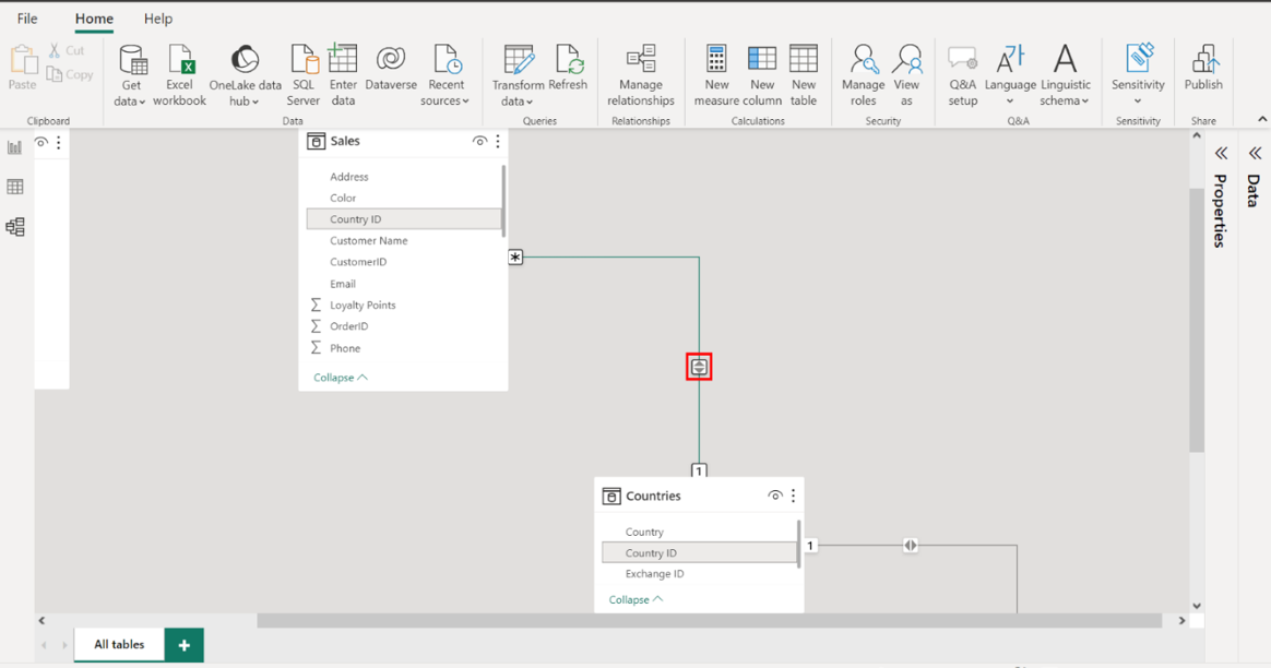
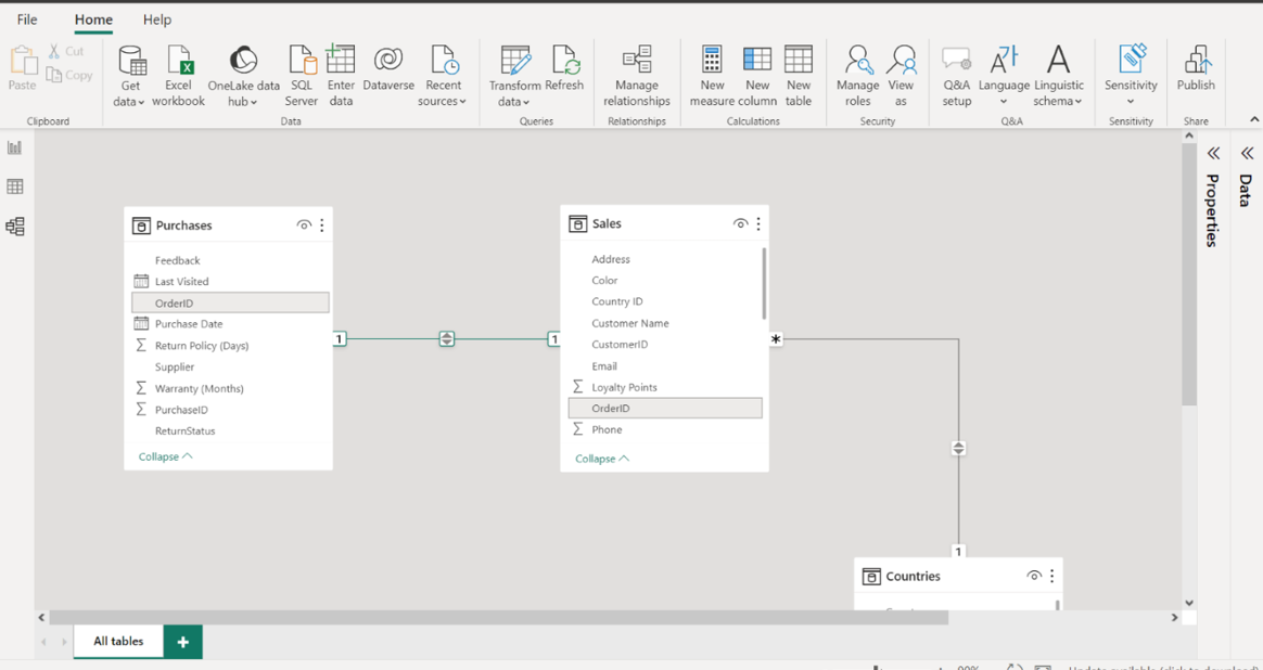
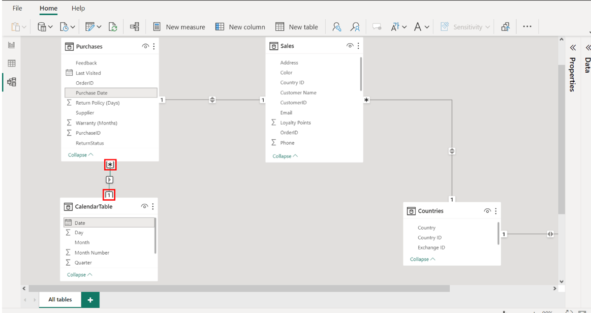
Step 2: Create a relationship between Sales and Countries
Create a relationship on the Country ID field between the Sales and Countries tables. Like the previous task, establish a connection on the Country ID field between the Sales and Countries tables to allow for geographical analysis of sales data.
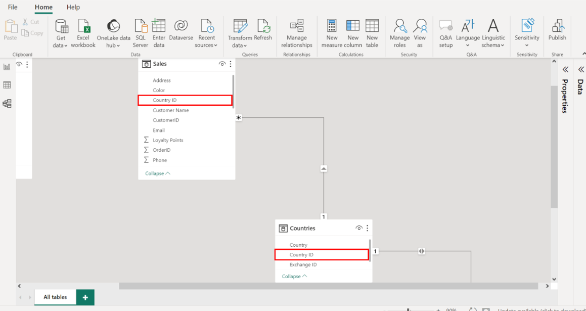
1. Set the Cardinality to Many to One (1:1).
2. Set the Cross-filter direction to Both so that it’s bi-directional.
3. Ensure the Make this relationship active checkbox is selected.
Right-click the relationship, access the Edit relationship menu, and configure the above relationship settings as you did for the tables in the previous task. Your settings should resemble the following screenshot.
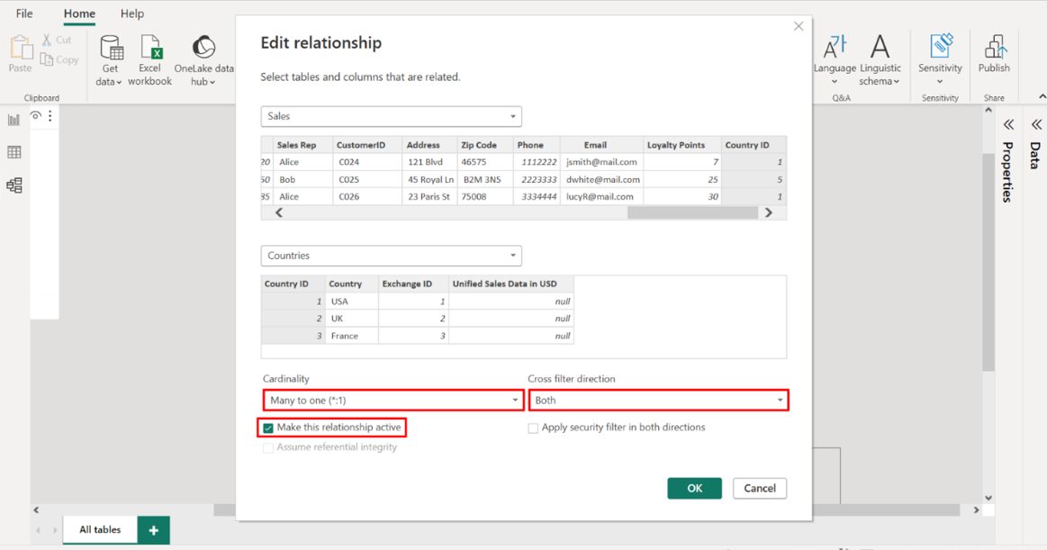
Inspect the relationship arrow in the Model View to ensure the arrows point in both directions and display a *:1 symbol on either end of the connector. Select OK to apply your settings and return to Model View. Your model should resemble the screenshot below. Inspect the relationship arrow to ensure that it illustrates a bi-directional connection, complete with a *:1 symbol correctly representing the many-to-one relationship inherent in the sales data structure.
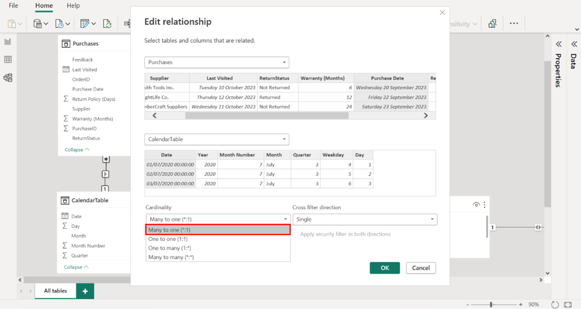
Step 3: Create a relationship between the Purchases and Sales tables
Create a relationship on the OrderID field between the Purchases and Sales tables. Create a relationship using the OrderID field as a bridge between the Purchases and Sales tables, linking procurement with sales.
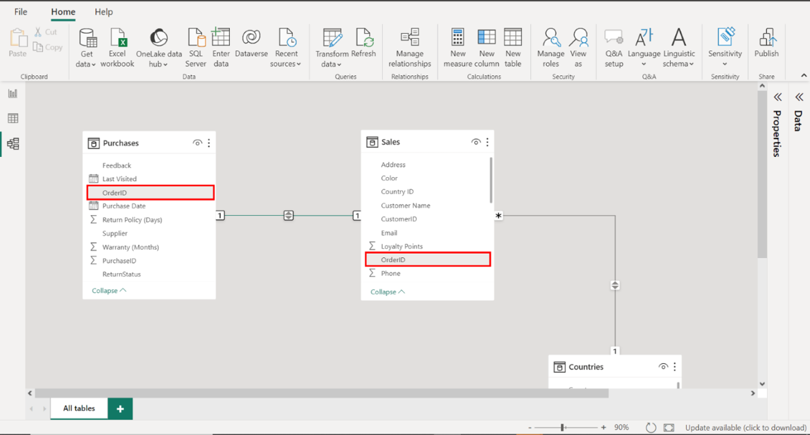
1. Set the Cardinality to One to One (1:1).
2. Set the Cross filter direction to Both to be bi-directional.
3. Ensure the Make this relationship active checkbox is selected.
Right-click the relationship, access the Edit relationship menu, and configure the above relationship settings as you did for the tables in the previous task. Your settings should resemble the following screenshot.
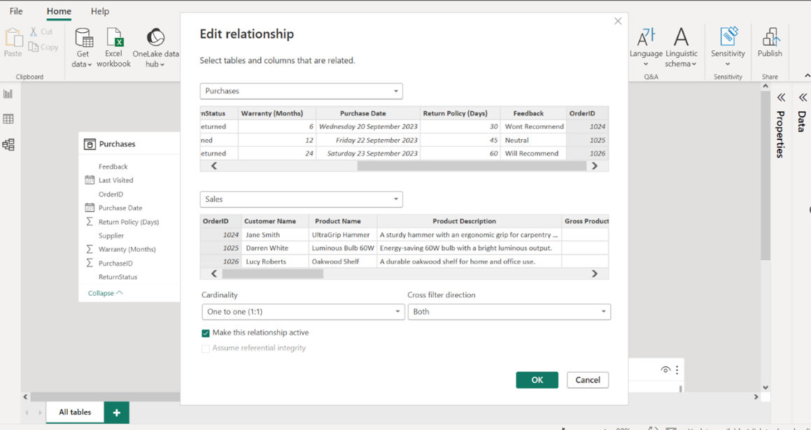
Inspect the relationship arrow in the Model View to ensure the arrows point in both directions and display a 1:1 symbol on either end of the connector. Select OK to apply your settings and return to Model View. Your model should resemble the screenshot below. Validate the relationship arrow in the Model View to check that it indicates a bidirectional flow, complete with a 1:1 symbol at both ends, affirming a one-to-one correspondence between each order and its sales outcome.
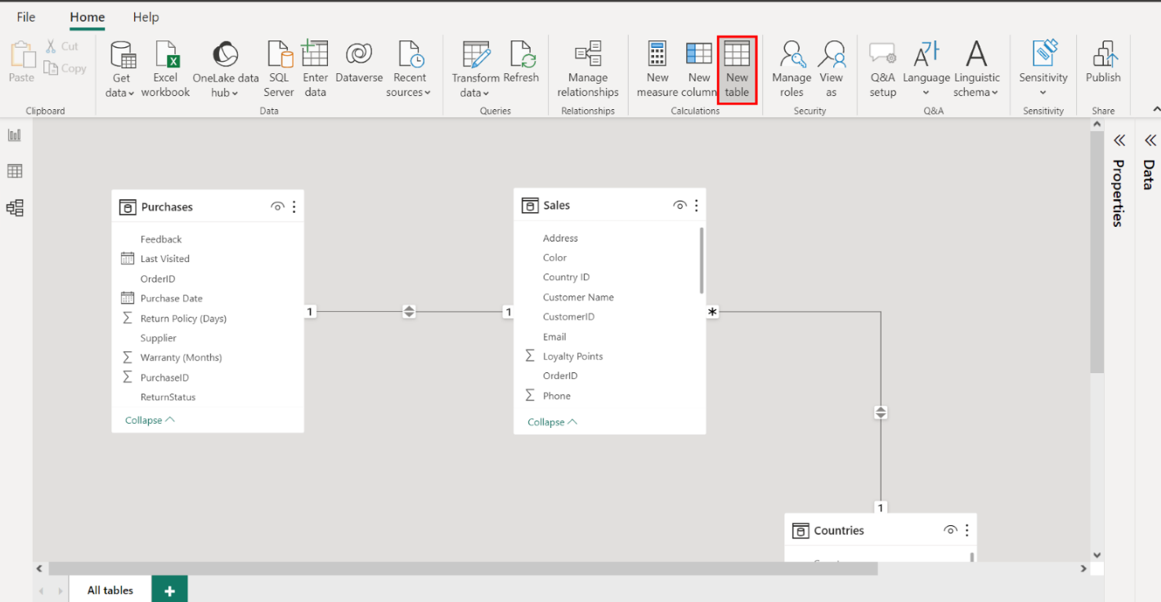
Step 4: Configure the Calendar table
Select New Table and add the following DAX code to create a new Calendar table:
CalendarTable =ADDCOLUMNS(
CALENDAR(DATE(2020, 1, 1), DATE(2023, 12, 31)),
"Year", YEAR([Date]),
"Month Number", MONTH([Date]),
"Month", FORMAT([Date], "MMMM"),
"Quarter", QUARTER([Date]),
"Weekday", WEEKDAY([Date]),
"Day", DAY([Date])
)
Select New Table and input the provided DAX code to create a Calendar table, an indispensable tool for any time-based analysis.
This table will become the backbone for time intelligence in the model, offering fields like Year, Month Number, Month, Quarter, Weekday, and Day, bringing a rich temporal dimension to the data landscape.
Step 5: Create a relationship between the Calendar and Purchasestables
Create a relationship on the Date field between the Calendar and the Purchase Date in the Purchases table. Create a relationship on the Date field that aligns the Calendar table and Purchase Date with Purchases.
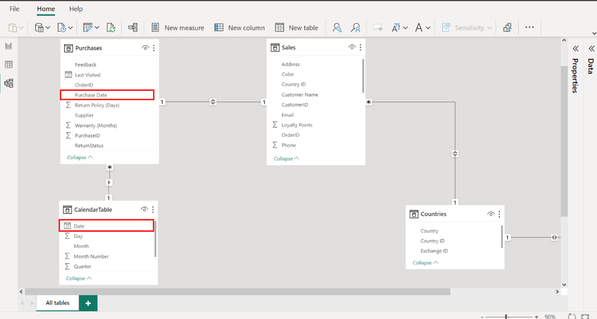
1. Set the Cardinality to Many to One (1:1).
2. Ensure the Make this relationship active checkbox is selected.
Right-click the relationship, access the Edit relationship menu, and configure the above relationship settings as you did for the tables in the previous task. Your settings should resemble the following screenshot.
Inspect the relationship arrow in the Model View to ensure the arrows point in both directions and display a *:1 symbol on either end of the connector. Select OK to apply your settings and return to Model View. Your model should resemble the screenshot below. Confirm that the relationship arrow correctly points in both directions and displays a *:1 symbol, validating the many-to-one relationship that connects Purchases to Dates.
Step 6: Create Sales in USD Calculated Table
Select New Table and add the following DAX code to create a new calculated table:
Sales in USD =
ADDCOLUMNS(
Sales,
"Country Name", RELATED(Countries[Country]),
"Exchange Rate", RELATED('Exchange Data'[Exchange Rate]),
"Exchange Currency", RELATED('Exchange Data'[Exchange Currency]),
"Gross Revenue USD", [Gross Revenue] * RELATED('Exchange Data'[Exchange Rate]),
"Net Revenue USD", [Net Revenue] * RELATED('Exchange Data'[Exchange Rate]),
"Total Tax USD", [Total Tax] * RELATED('Exchange Data'[Exchange Rate])
)
Create a new calculated table named Sales in USD by selecting New Table and entering the DAX code provided. This adjusts the Sales values into a unified currency format.
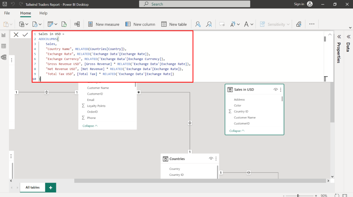
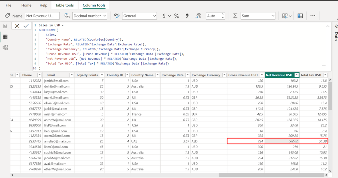
Note the Gross Revenue USD, Net Revenue USD, and Total Tax USD for the Order ID= 1035 on the Sales in USD table. The Net Revenue for Order ID 1035 placed by Amelia Carter is precisely 682.62 USD. The Gross Revenue USD measures 734 USD, and the Total Tax USD is 51.38 USD.
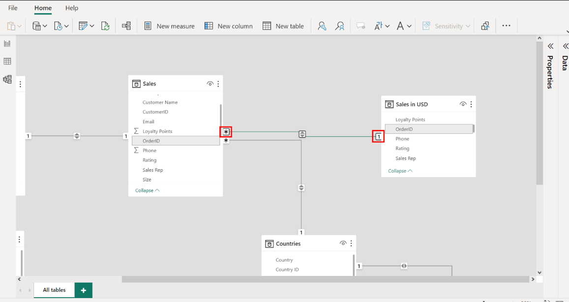
Step 7: Create a relationship between the Sales in USD and Sales tables
Create a relationship between the Sales in USD and Sales tables on the Order ID field. Link the Sales in USD table with the Sales table by creating a relationship based on the Order ID field, enabling Tailwind Traders to contrast the original sales data with its USD equivalent.
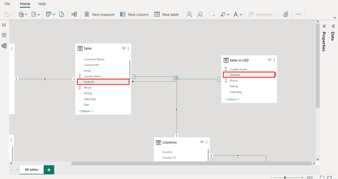
1. Set the Cardinality to Many to One (1:1).
2. Ensuring the Make this relationship active checkbox is selected.
Right-click the relationship, access the Edit relationship menu, and configure the above relationship settings as you did for the tables in the previous task. Your settings should resemble the following screenshot. Ensure the Make this relationship active checkbox is selected to prioritize this relationship as the default linkage for navigating between sales records and their USD counterparts.
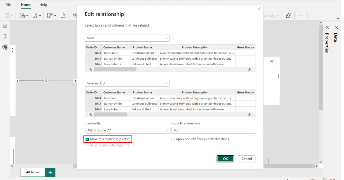
Inspect the relationship arrow in the Model View to ensure the arrows point in both directions and display a 1:1 symbol on either end of the connector. Select OK to apply your settings and return to Model View. Examine the relationship arrow to verify that it correctly illustrates a bi-directional relationship, with a *:1 symbol on either end, confirming the proper relationship structure for USD sales analysis.
Conclusion
With these steps, we have successfully prepared and configured sales data for Tailwind Traders and used this data to design and develop a data model.
Milestone 2: Configure Aggregations and Create Reports
Overview
In the second set of Capstone project exercises, we had to assist Tailwind Traders with configuring its aggregations and generating insights in the form of reports from its data.
The two exercises in this second phase were:
• Configure aggregations using DAX.
• And create sales and profit reports.
This reading provides a step-by-step guide for completing these tasks. It also includes screenshots that you can compare against your work.
Configure Aggregations using DAX
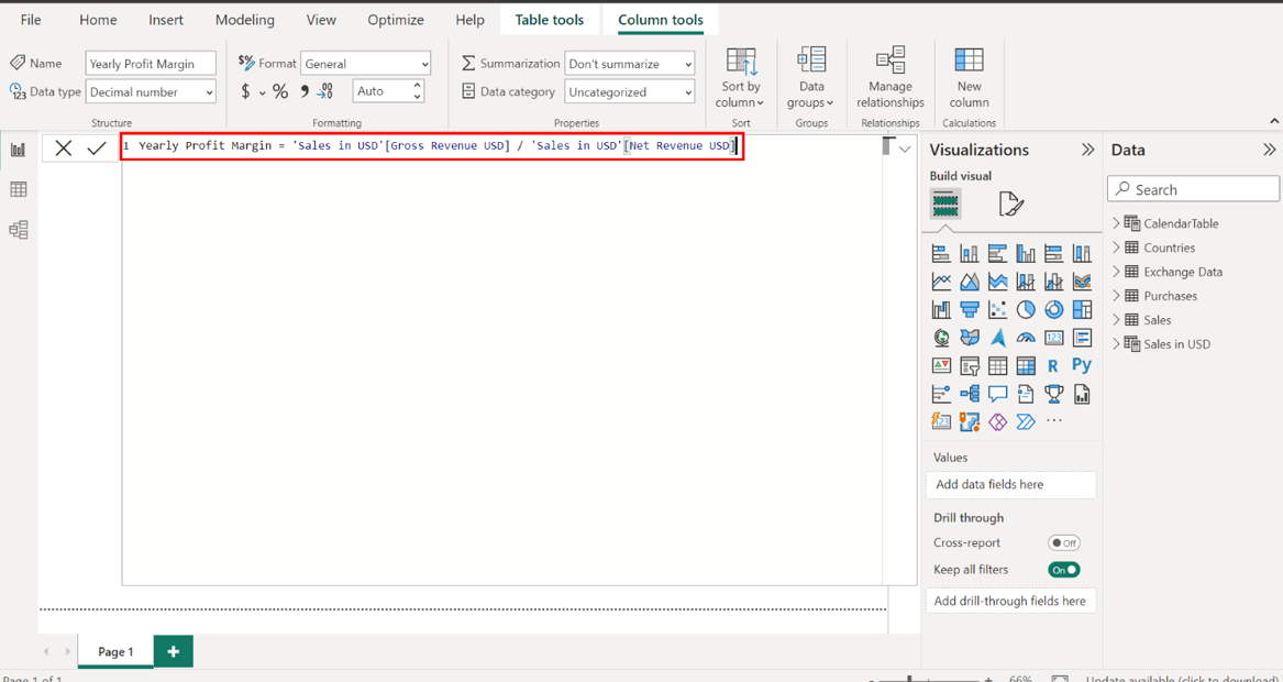
Step 1: Calculate Yearly Profit Margin using DAX.
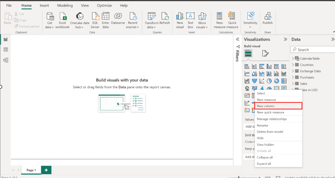
Create a new measure for the Sales in USD table. Right-click on the Sales in USD table in the Fields pane and select New Column
In the formula bar, create a new column that represents the yearly profit margin. This margin should be derived by dividing the gross revenue by the total net revenue within the Sales in USD table.
Right-click on the Sales in USD table in the Fields pane and select New Column to set the stage for this calculation. Then, input the provided DAX formula into the formula bar.
Yearly Profit Margin = 'Sales in USD'[Gross Revenue USD] / 'Sales in USD'[Net Revenue USD]
This calculation divides the Gross Revenue by the Net Revenue, and shows how much money is kept as profit from sales after costs. This measure provides an overarching view of Tailwind Traders’ financial efficiency throughout the year and is a key indicator of the company's financial health.
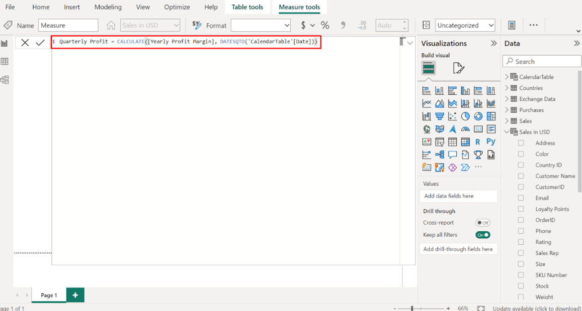
Step 2: Calculate Quarterly Profit using DAX and time intelligence functions.
Create a new measure for quarterly profit. Consider using a function that aggregates data until the end of the current quarter. To achieve this, you must reference the calculated yearly profit and a calendar table.
As you did in the previous task, right-click the Sales in USD table in the Fields pane and select New Column. Then, input the provided DAX formula into the formula bar:
Quarterly Profit = CALCULATE([Yearly Profit Margin], DATESQTD('CalendarTable'[Date]))
This calculation isolates the profit made in each quarter by using a time intelligence function, which filters the profit to each respective quarter. This data provides actionable insights for short-term planning and strategy.
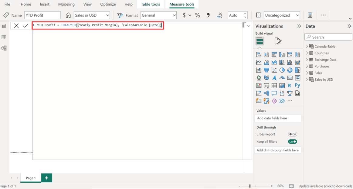
Step 3: Calculate Year-to-Date Profit using DAX.
1. Right-click on the Sales in USD table in the Fields pane and select New Measure.
2. Create a new measure for the year-to-date profit. You'll need a function aggregating data from the start of the year to the current date.
As you did in the previous task, right-click the Sales in USD table in the Fields pane and select New Column. Then, input the provided DAX formula into the formula bar:
YTD Profit = TOTALYTD([Yearly Profit Margin], 'CalendarTable'[Date])
This measure accumulates the profit from the first day of the fiscal year to the current date, providing a running total of Tailwind Traders' profitability. This step provides a real-time snapshot of the company’s financial trajectory, allowing for comparison against the same period in previous years or projected targets.
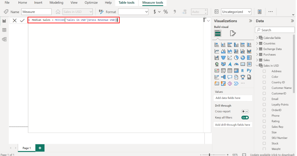
Step 4: Calculate Median Sales using the MEDIAN function in DAX.
1. Right-click on the Sales in USD table in the Fields pane and choose New Measure.
2. In the formula bar, create a new measure to represent the median sales. Consider the statistical functions in DAX that can help you find the middle value of gross revenue.
Right-click on the Sales in USD table and choose New Measure. Input the provided DAX formula into the formula bar.
Median Sales = MEDIAN('Sales in USD'[Gross Revenue USD])
The median is a statistical measure that indicates the middle value in a set of numbers, which, in this case, represents sales volumes. Using the MEDIAN function on Gross Revenue identifies the sales value at the center of the dataset.
Step 5: Use the Performance Analyzer to optimize report performance.
1. Find and select the Performance Analyzer option within the View tab.
Upon selecting the Report view icon, you must open the Performance Analyzer. Locate and select the View tab on the ribbon interface at the top of your Power BI report. Within the View tab, find and select the Performance Analyzer option.
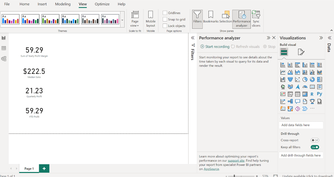
1. Create an empty Card visual and drag the Yearly Profit Margin field to the Fields well. Repeat this process for the Median Sales, Quarterly Profit, and YTD Profit.
Select the Card icon in the Visualizations pane. An empty Card visual appears on the canvas. Locate the Sales in USD table and drag the Yearly Profit Margin field to the Fields well in the Visualizations pane. Repeat this process for the Median Sales, Quarterly Profit and YTD Profit.
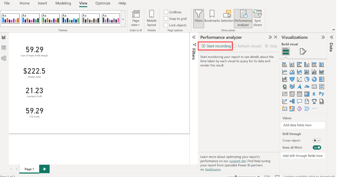
1. Begin recording the performance of the card visuals using the Performance Analyzer’s recording feature.
Locate and select the Start Recording button in the Performance Analyzer pane.
1. Refresh your reports to test their performance.
You can refresh a report using two methods:
• Select the Refresh button in the Home tab of the ribbon interface
• or interact directly with the report.
As you interact with the report while the Performance Analyzer is recording, it tracks and documents the time taken to load each visual item.
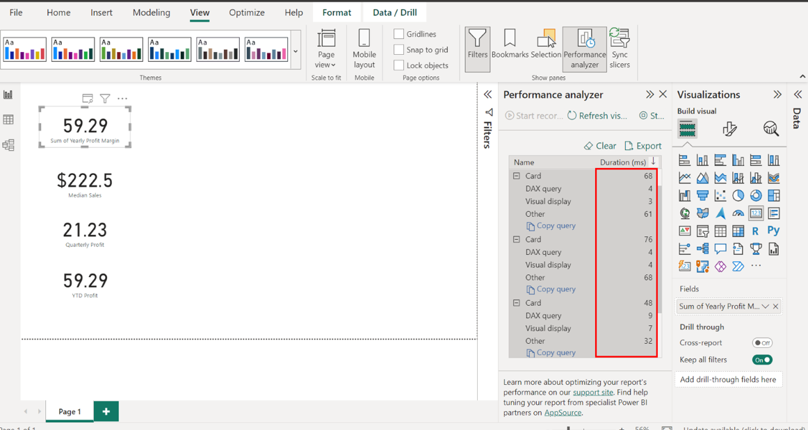
1. Observe the list of all visual items in your report and their respective load times. Ensure the DAX query time of visual items is < 200ms and note any slow-loading visuals.
Observe the list of all visual items in your report and their respective load times. Ensure the DAX query time of visual items is < 200ms and note down any slow-loading visuals. This step is important not only for data analysis accuracy but also for reports' performance optimization.
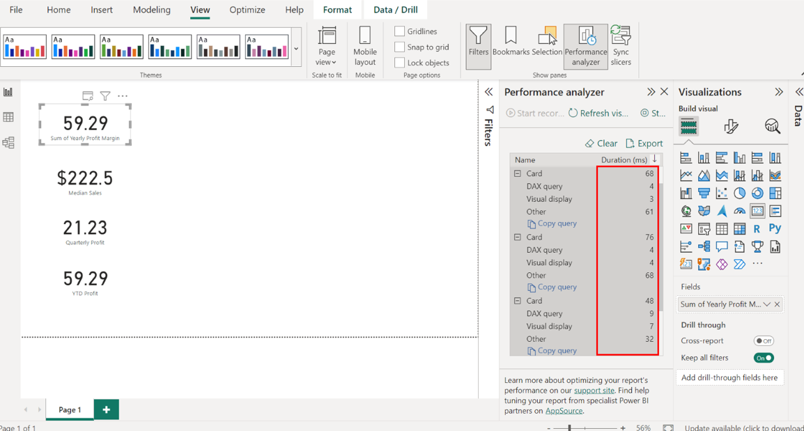
1. Select Stop and remove all Card visuals, resulting in a blank Canvas.
Select Stop and remove all Card visuals upon completion, resulting in a blank Canvas.
Create Sales and Profit Reports
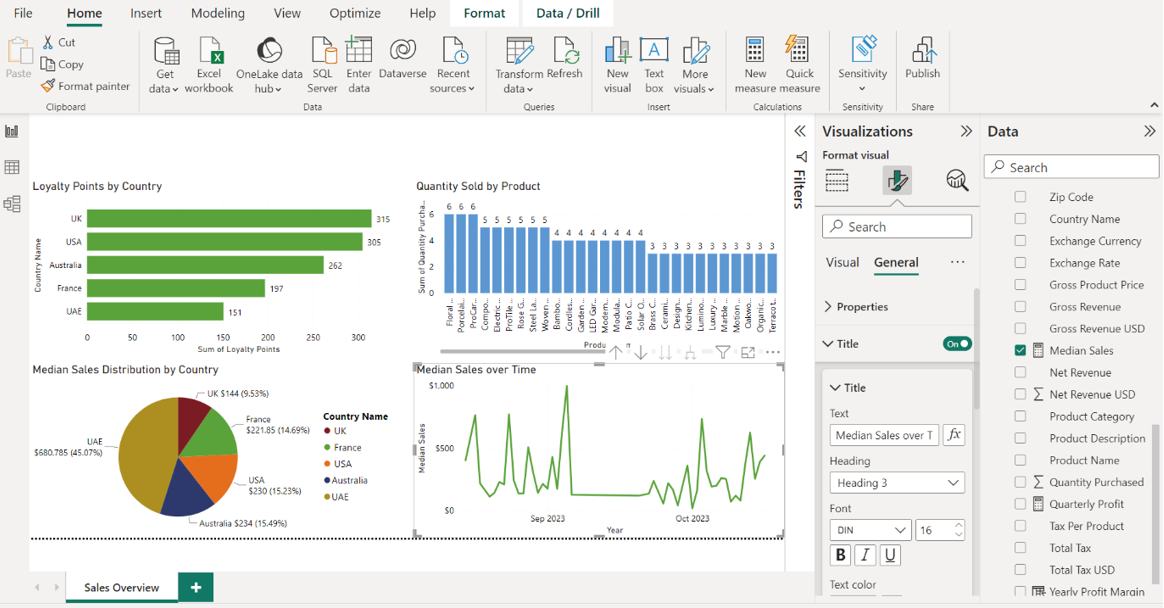
Step 1: Create a Sales Overview report with various visualizations such as bar charts, column charts, pie charts, and line charts.
1. Open the Tailwind Traders Report.pbix Power BI file.
OpenPower BI Desktop and select the File menu in the top left corner.
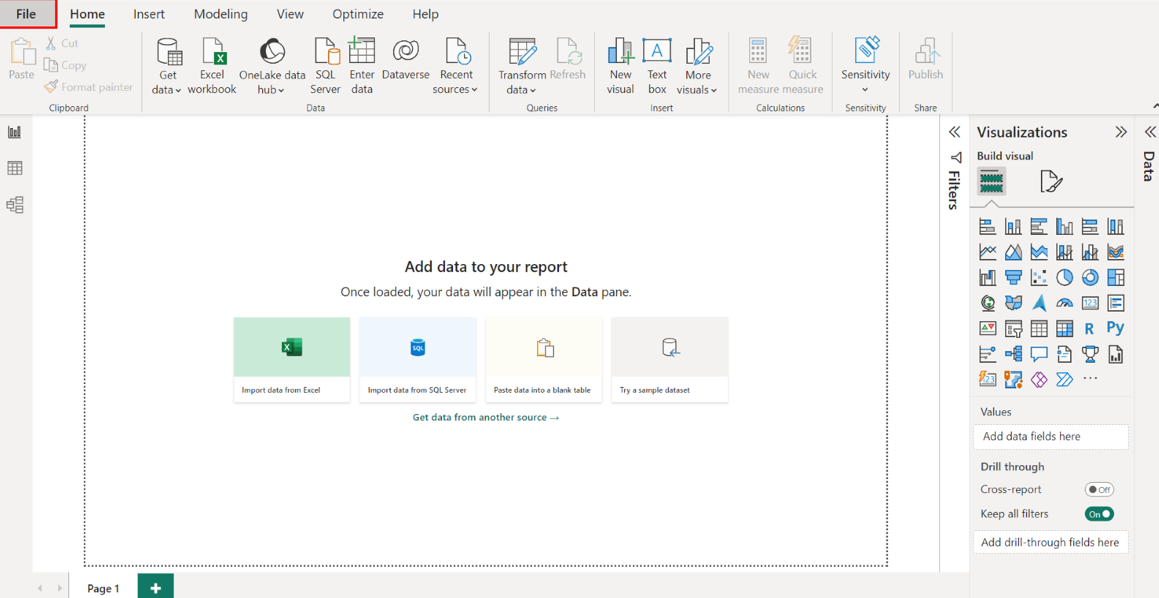
Navigate to the location where your Tailwind Traders Report.pbix file is saved.
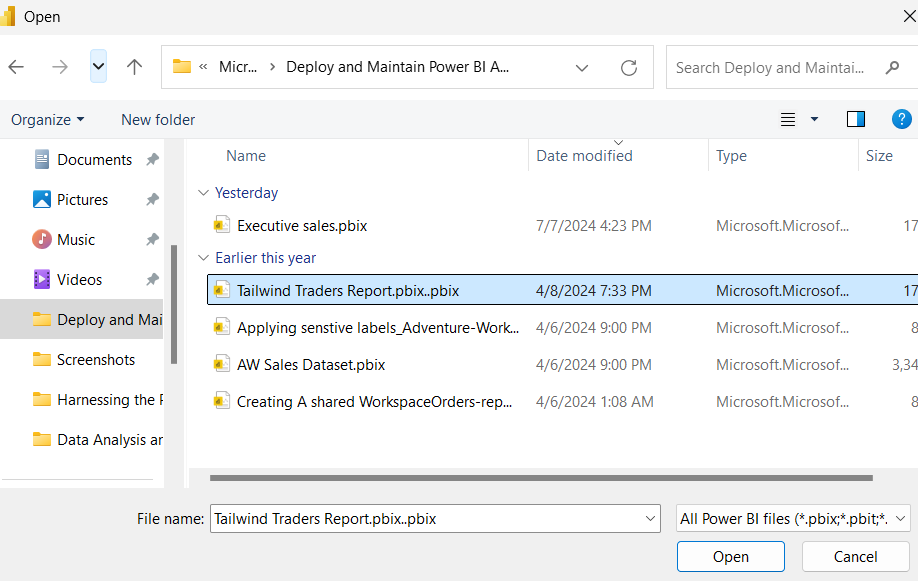
Select the Tailwind Traders Report.pbix file and select Open in the file explorer window. This action opens the saved project in the Power BI Desktop application.
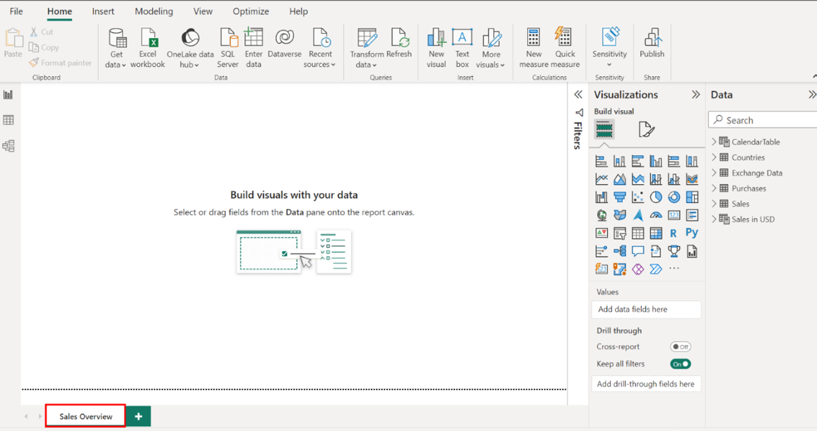
Rename the report Sales Overview.
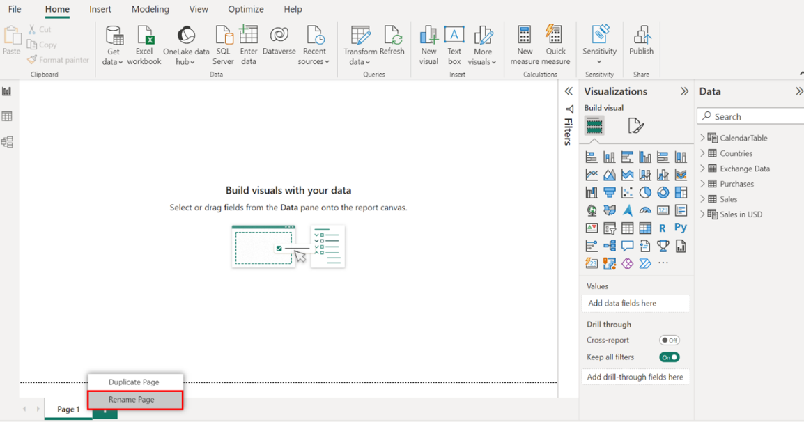
Right-click the page name and select Rename Page from the list of options. Rename the page to Sales Overview.
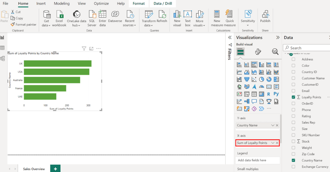
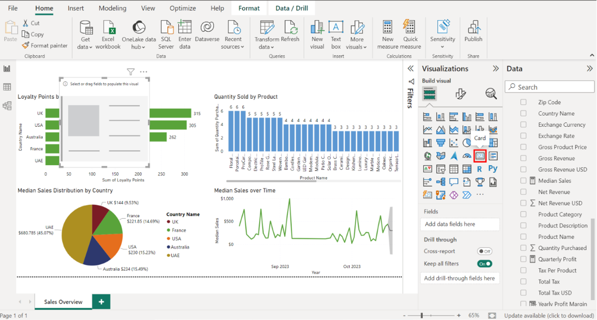
Step 2: Create a bar chart for loyalty points by country
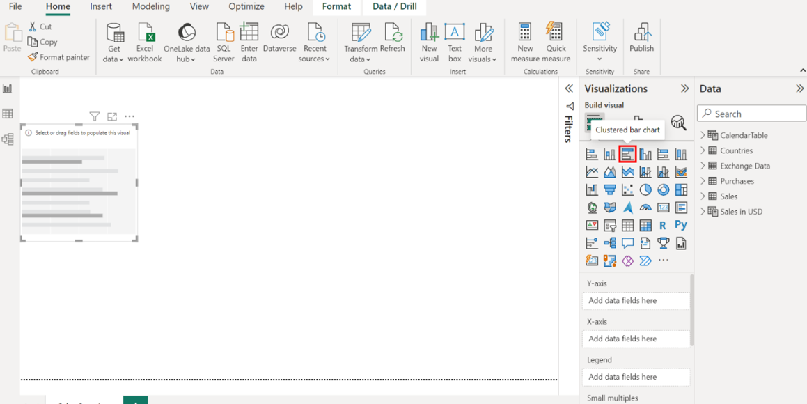
Create a clustered bar chart that visualizes loyalty points by country using data from the Sales in USD table.
the Visualizations pane on the right-hand side of your screen. Select the Clustered bar chart icon to create an empty bar chart visualization on the canvas.
1. Configure the chart as follows:
• Display the country names on the Y-Axis.
• Display the loyalty points on the X-Axis.
• Resize and position the chart to the left side of the canvas.
• Title the chart Loyalty Points by Country.
• Toggle on the data labels.
Locate the Fields pane on the right-hand side of the screen. This area contains theSales in USD table. Select the table to expand it and view its fields.
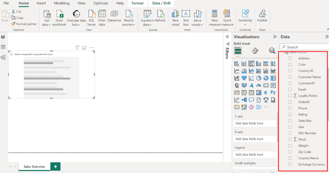
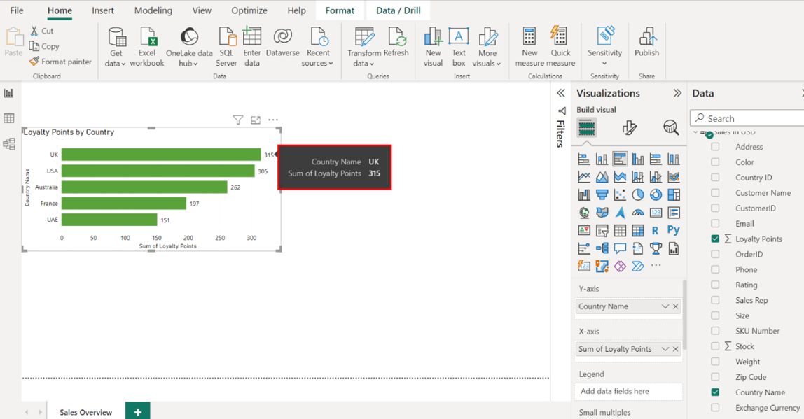
Drag the Country Name field from the Fields pane to the Y-Axis well in the Visualizations pane.
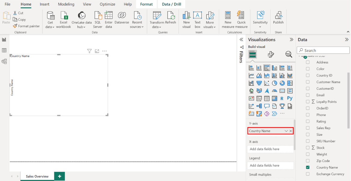
Next, drag the Loyalty Points field from the Fields pane to the X-Axis well in the Visualizations pane.
Select the edges of the bar chart on your canvas to resize it and place it on the left side of the canvas.
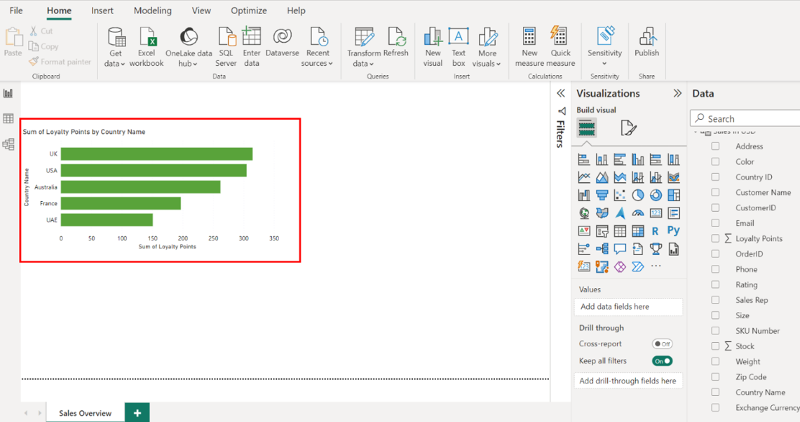
To format this visual, select the Format tab and title the chart Loyalty Points by Country.
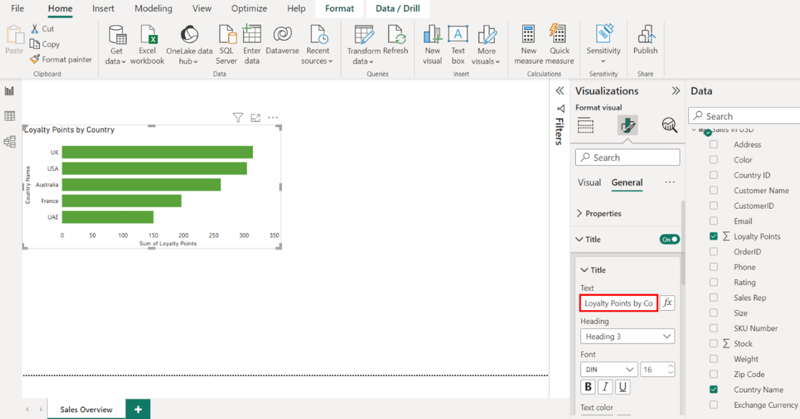
Next, select Data labels and toggle the switch ONto display the loyalty points on each bar.
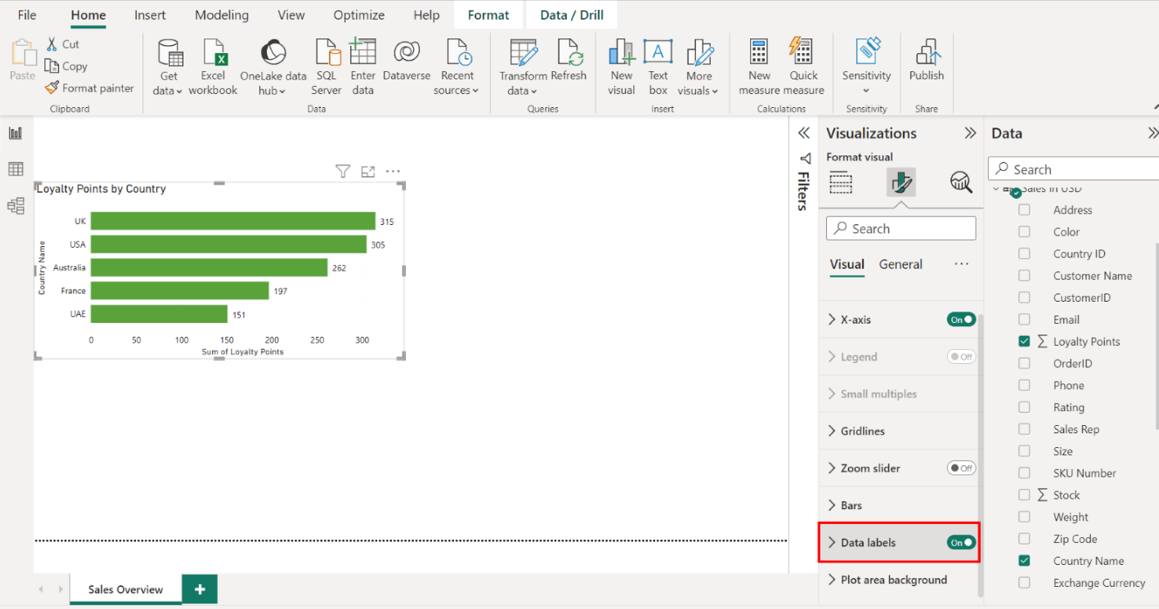
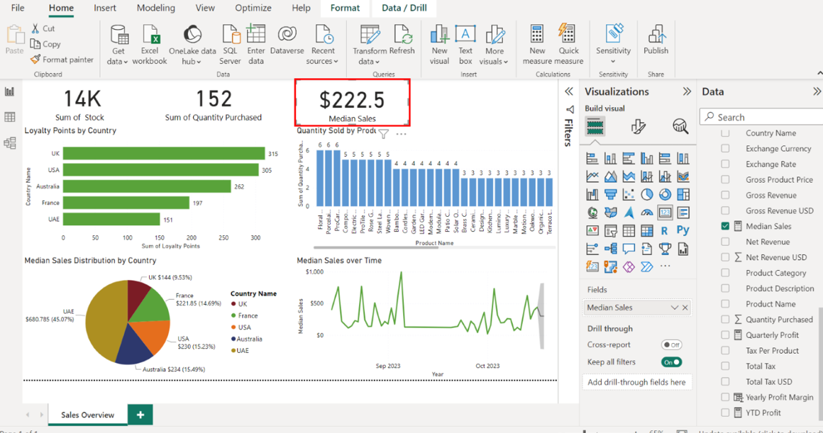
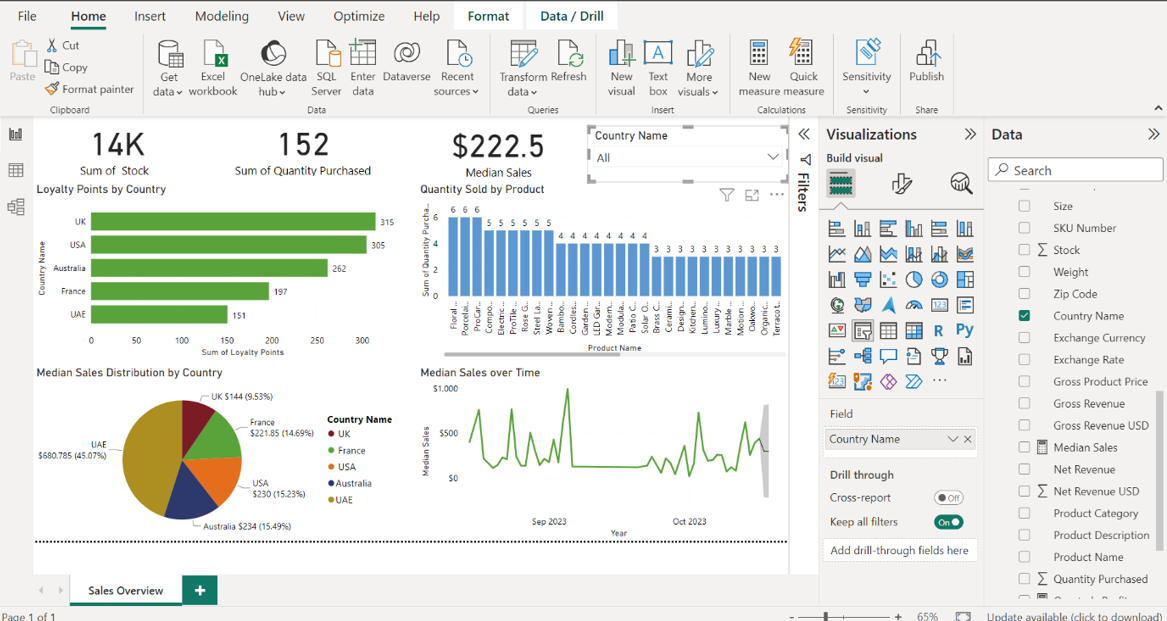
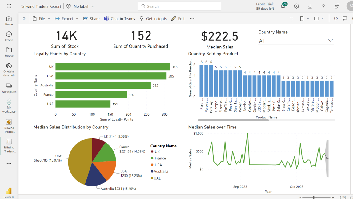
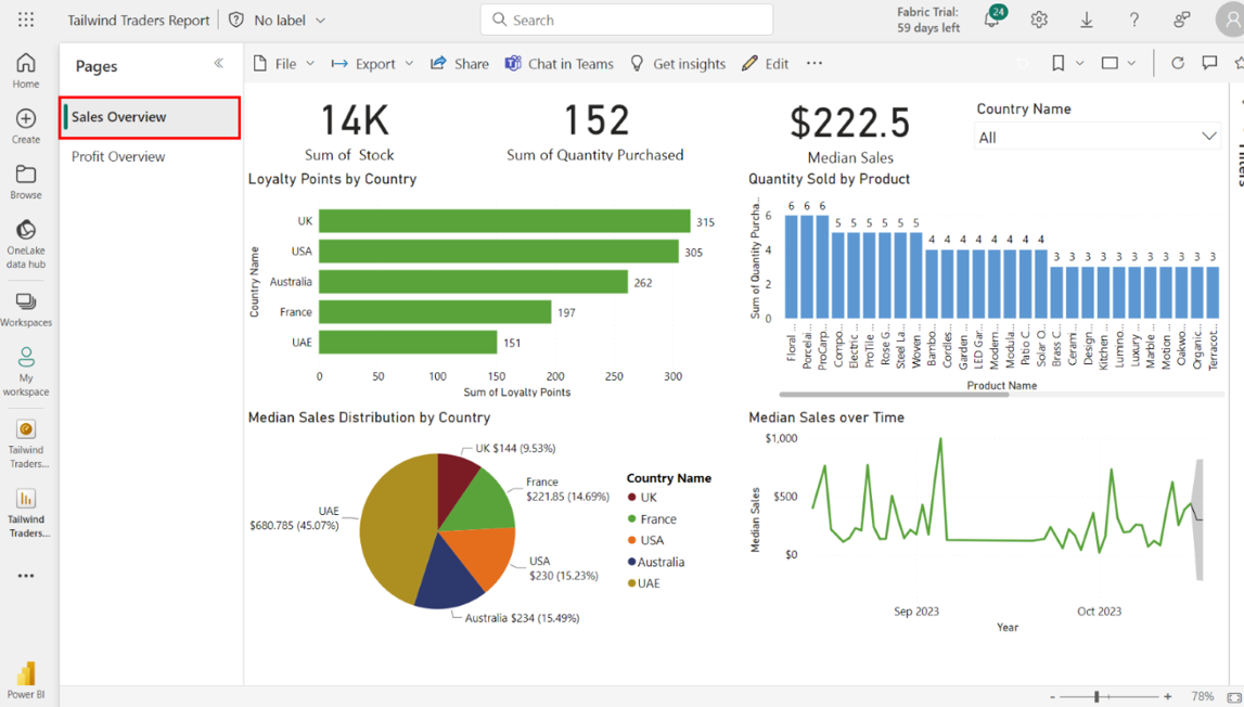
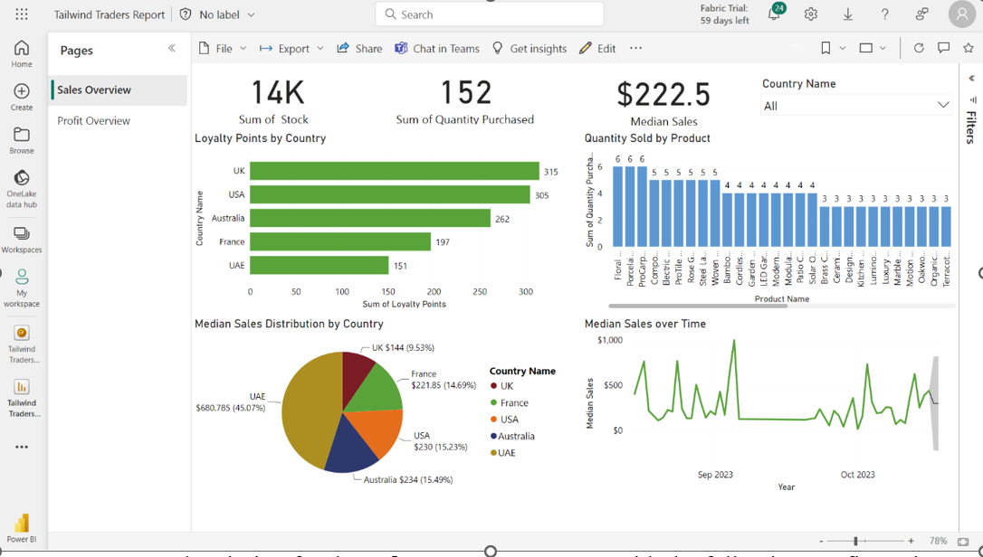
Note down the country with the highest Loyalty Points value. The UK leads the chart with 315 loyalty points.
Step 3: Create a column chart for Quantity Sold by Product
Create a clustered column chart that visualizes the quantity sold by product using data from the Sales in USD table.
Select the Clustered column chart icon from the Visualizations pane to create an empty column chart visualization on the canvas.
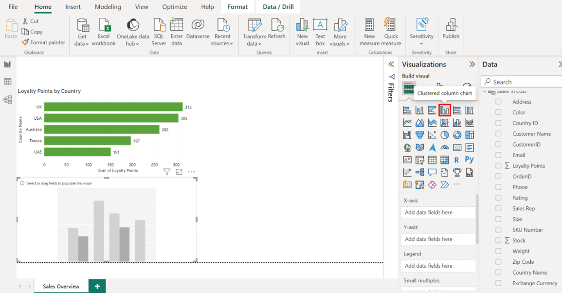
1. Configure the chart as follows:
• Display the product names on the Y-Axis.
• Display the quantity purchased on the X-Axis.
• Resize and position the chart to the right of the Loyalty Points by Country bar chart.
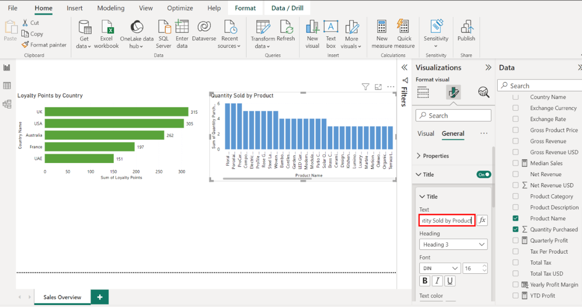
• Title the chart Quantity Sold by Product.
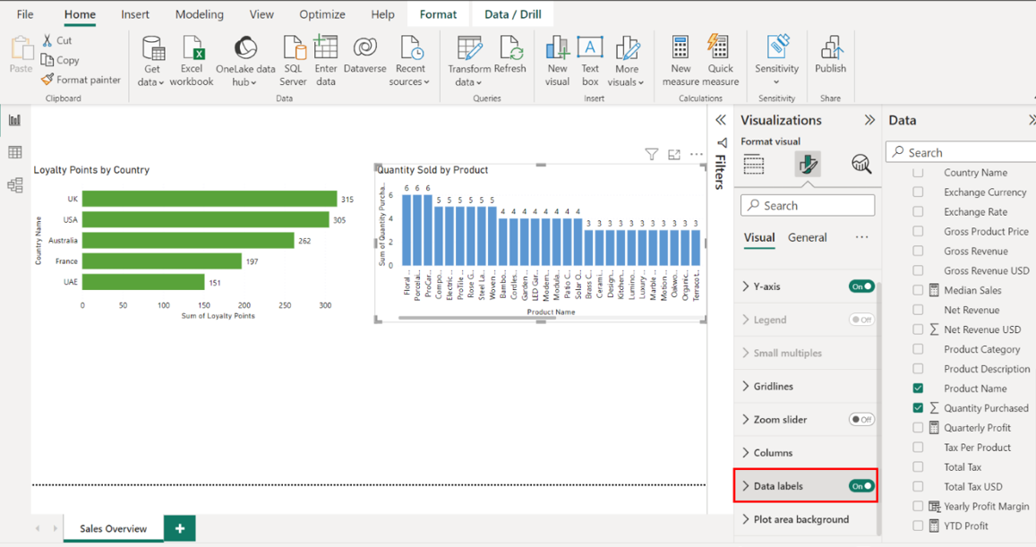
• Toggle on the data labels.
Locate the Sales in USD table on the right-hand side of the screen. Drag the Product Name field from the Fields pane to the X-Axis well in the Visualizations pane. Next, drag the Quantity Purchased field from the Fields pane to the Y-Axis well in the Visualizations pane.
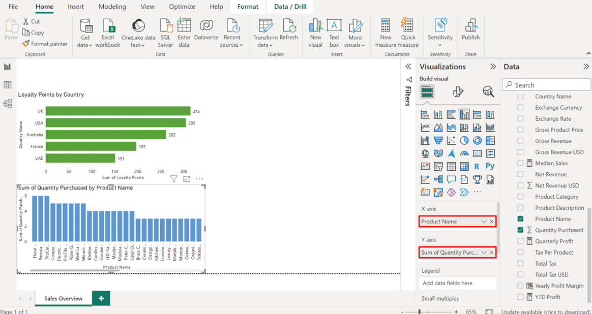
Select the edges of the visualization on your canvas to resize it, and place it on the right, next to the Loyalty Points by Country bar chart.
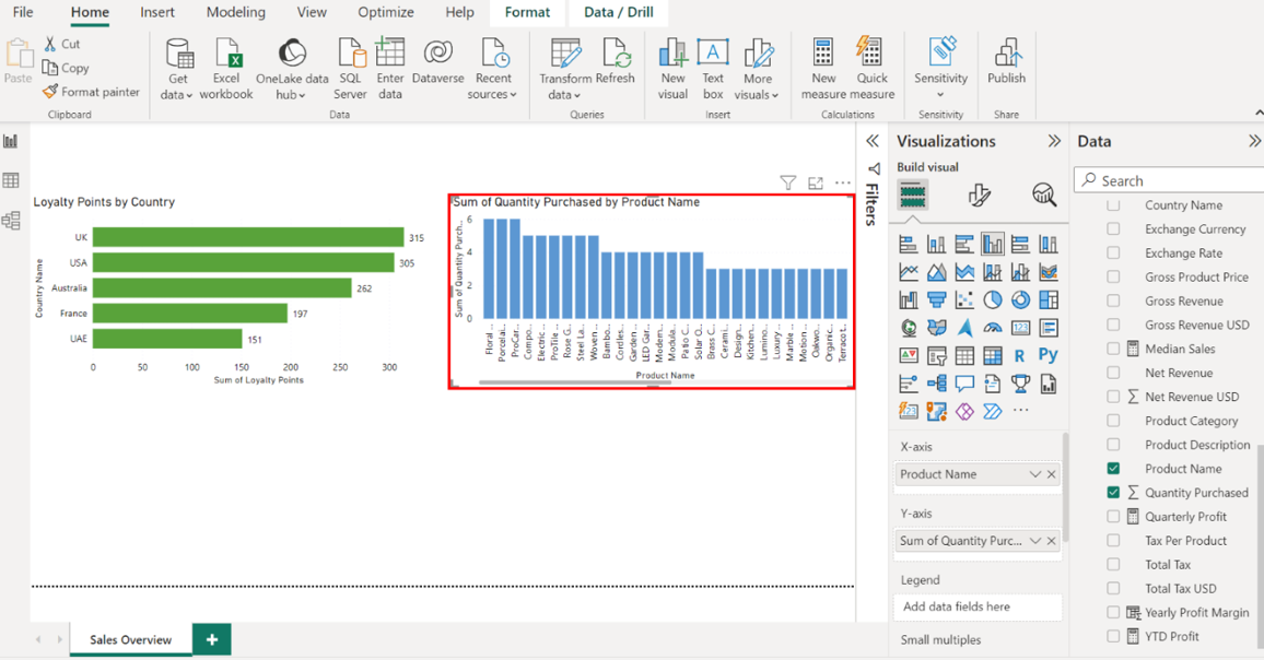
Navigate to the Format options and title the chart Quantity Sold by Product.
Select Data labels and toggle the switch ON to display the quantity sold on each column.
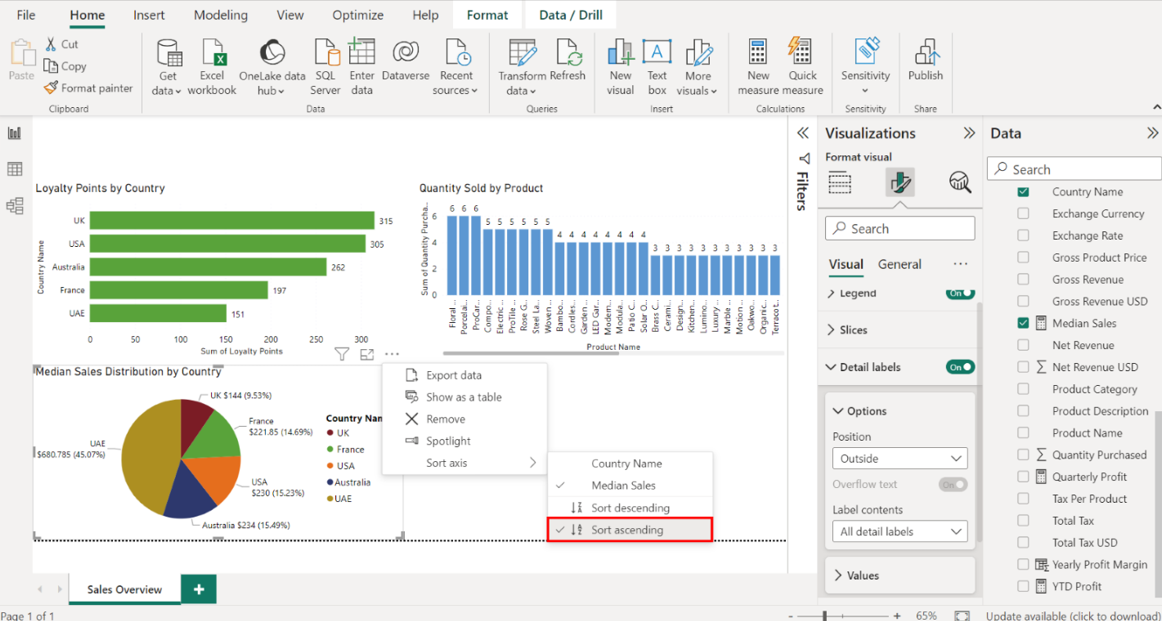
Step 4: Create a pie chart for median sales distribution by country
Create a pie chart that visualizes median sales distribution by country using data from the Sales in USD table.
Select the Pie chart icon from the Visualizations pane to create an empty pie chart visualization on the canvas.
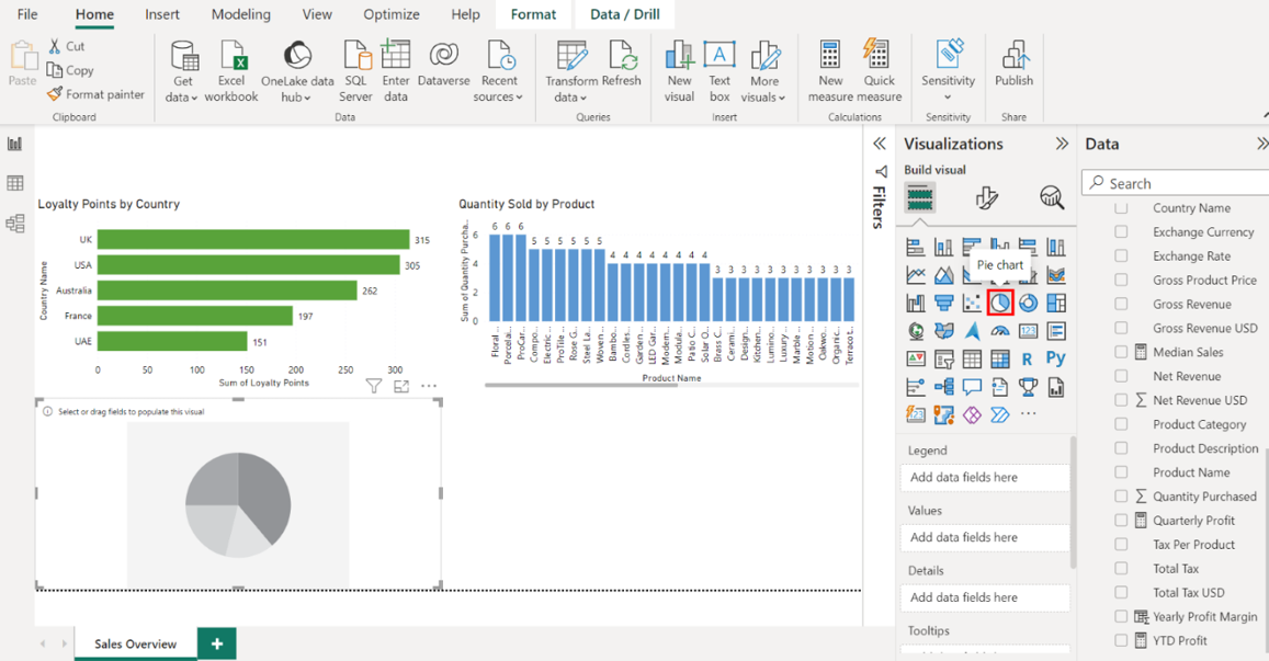
1. Configure the chart as follows:
• Display the country names in the Legend area.
• Display the median sales in the Values area.
• Adjust the chart size and position it below the Loyalty Points by Country bar chart.
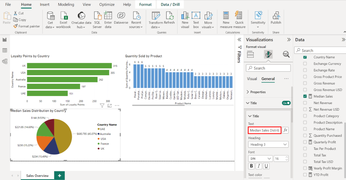
• Title the chart Median Sales Distribution by Country.
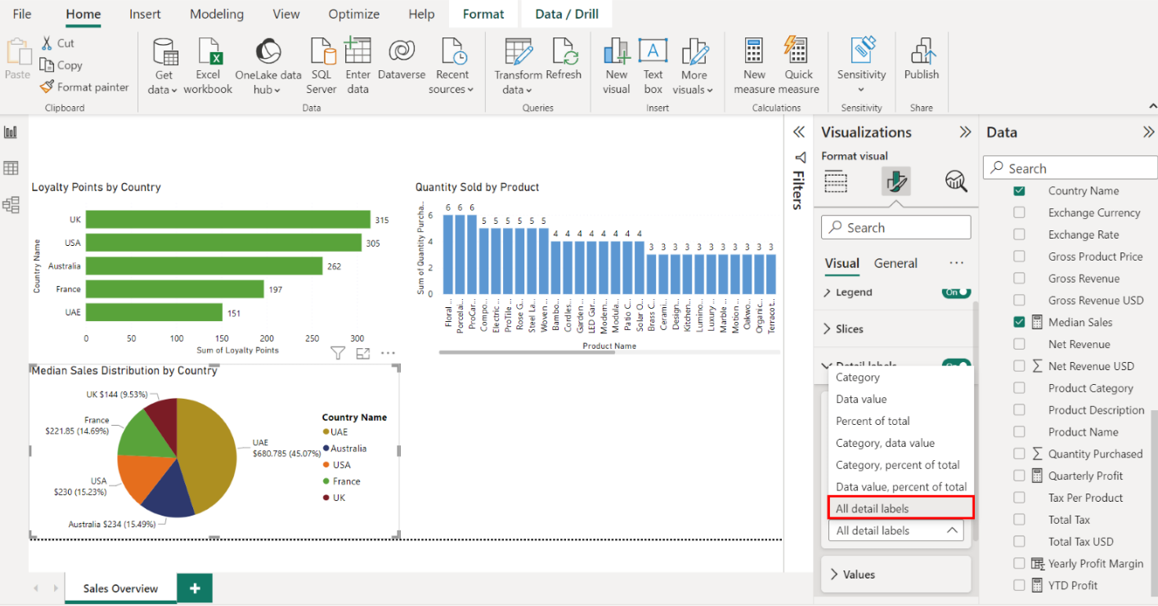
• Display detailed labels.
Locate the Sales in USD table on the right-hand side of the screen and drag the Country Name field from the Fields pane to the Legend well in the Visualizations pane. Then, drag the Median Sales field from the Fields pane to the Values well in the Visualizations pane.
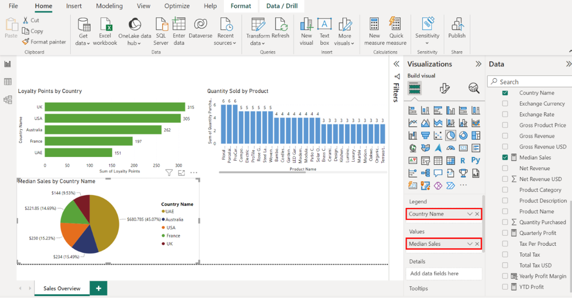
Select the edges of the visualization on your canvas to resize it, and place it below the Loyalty Points by Country bar chart.
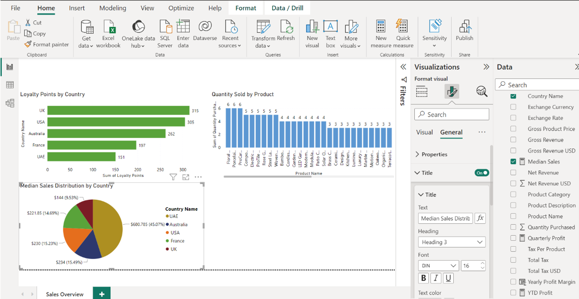
Title the chart Median Sales Distribution by Country.
Select Detailed labels, and from the dropdown, select All detail labels.
Sort the data in ascending order. Select the ellipses located at the top right corner of the visualization. Select the SortAxis dropdown, then select Sort ascending.
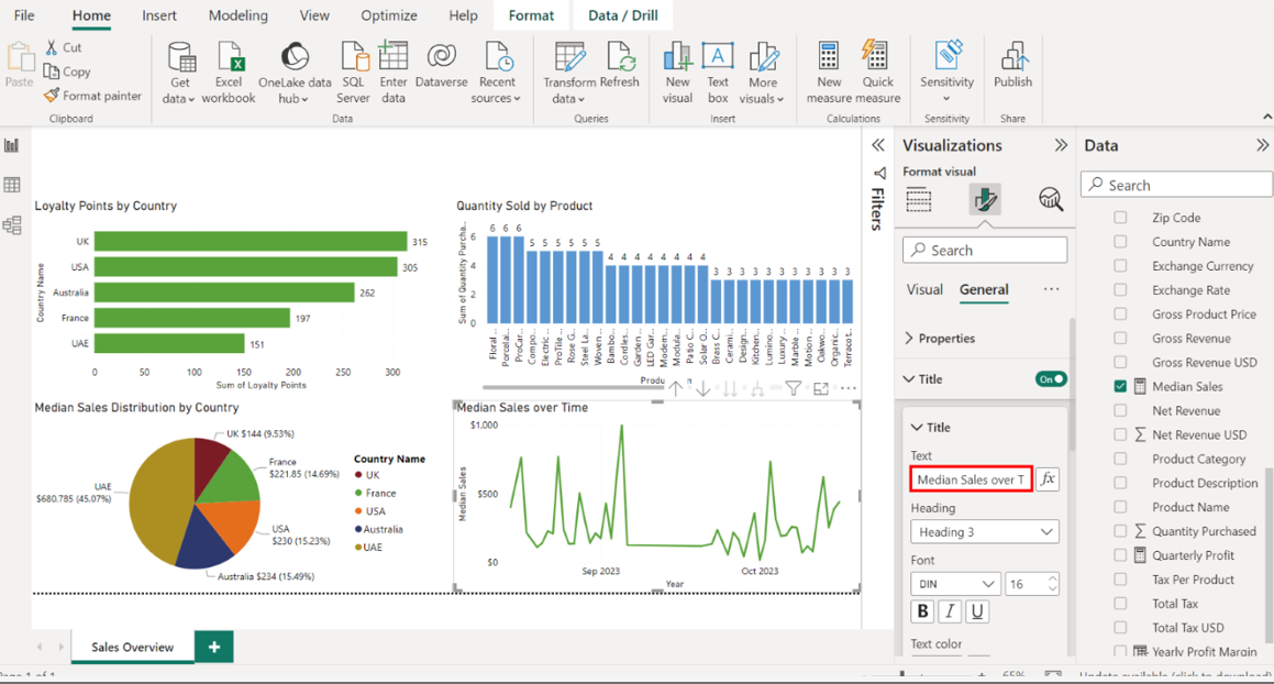
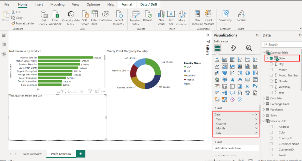
Step 5: Create a line chart for median sales over time
Create a line chart that visualizes median sales over time using data from the Sales in USD table. Select the Line chart icon from the Visualizations pane to create an empty line chart visualization on the canvas.
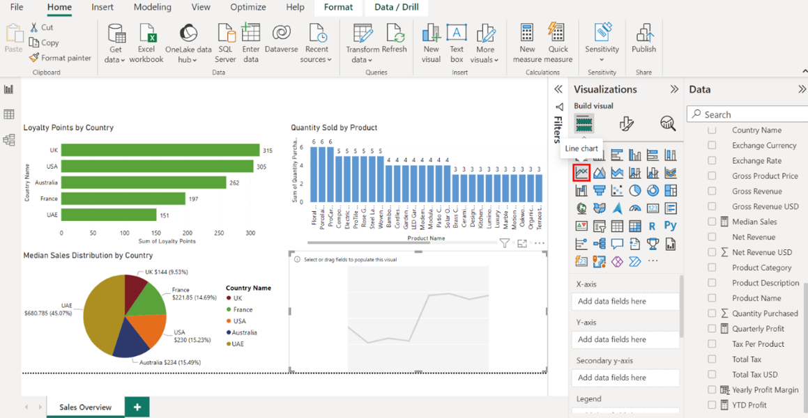
1. Configure the chart as follows:
• Display date data on the X-axis.
• Display median sales data on the Y-axis.
• Adjust and position the chart below the Quantity Sold by Product column chart.
• Title the chart Median Sales Over Time.
• Toggle on the data labels.
Locate the CalendarTable on the right-hand side of the screen. Drag the Date field from the Fields pane to the X-Axis well in the Visualizations pane.
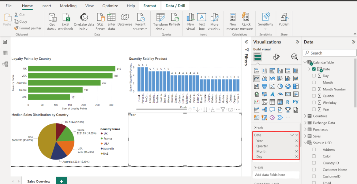
Locate the Sales in USD table and drag the Median Sales field from the Fields pane to the Y-Axis well in the Visualizations pane.
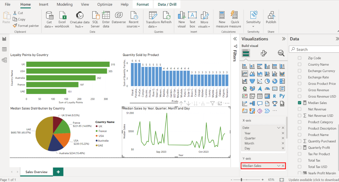
Select the edges of the visualization on your canvas to resize it, and place it below the Quantity Sold by Product column chart.
Title the chart Median Sales over Time.
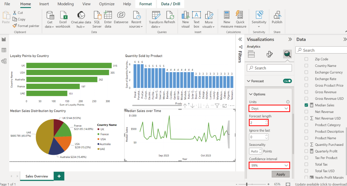
1. Configure an analytics forecast as follows:
• Set Units to Days.
• Set Forecast Length to 2.
• Set Confidence interval to 99%.
Select the Analytics tab, represented by a magnifying glass icon. Locate the Forecast option and toggle the switch beside it to add a forecast line to your chart.
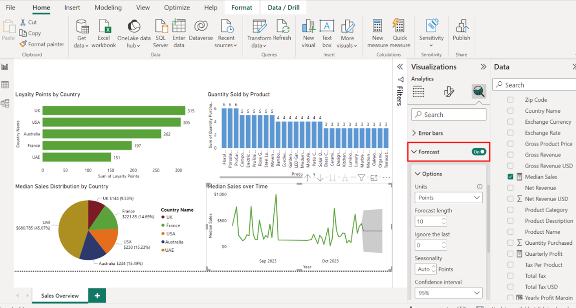
Set the Units to Days, Forecast Length to 2, and the Confidence interval to 99%. Select Apply to apply the changes. The forecasted line appears on your line chart in a different color with shading to indicate the confidence intervals.
Step 6: Create cards to visualize your measures
1. Create cards that visualize the following measures:
• Stock.
• Quantity Purchased.
• Median Sales.
Select the Card icon in the Visualizations pane while ensuring nothing is selected on the canvas. An empty Card visual appears on the canvas.
Locate the Sales in USD table and drag the Sum of Stock field to the Fields well in the Visualizations pane.
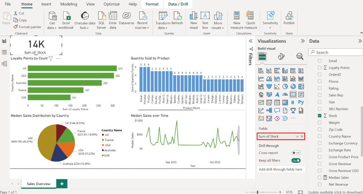
Repeat this process for the Sum of Quantity Purchased and Median Sales measures.
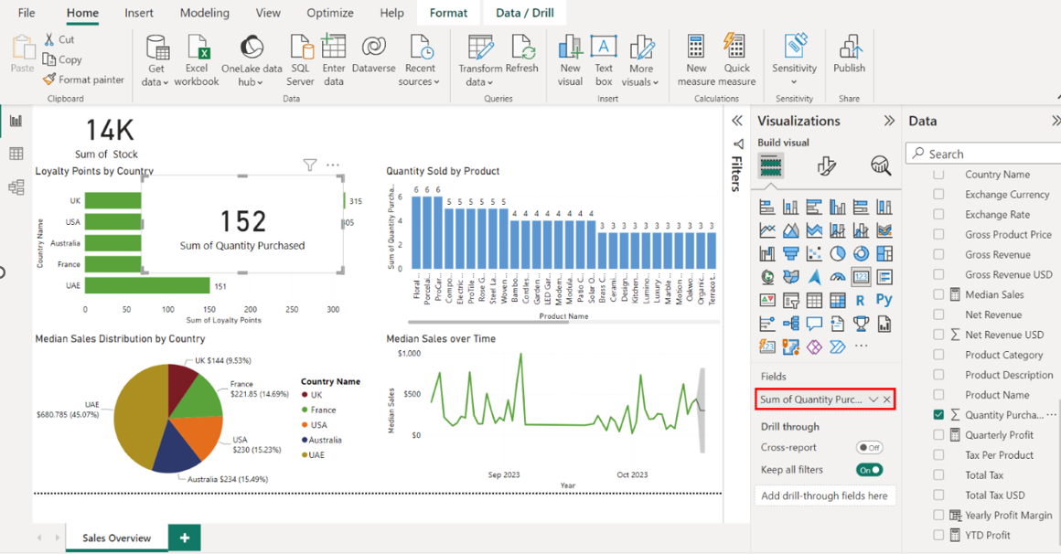
1. Position the cards as follows:
• Place the Stock and Quantity Purchased cards above the Loyalty Points by Country bar chart.
• Place the Median Sales card above the Quantity Sold by Product column chart.
Select the edges of the Stock and Quantity Purchased cards on your canvas to resize them. Place both cards above the Loyalty Points by Country bar chart.
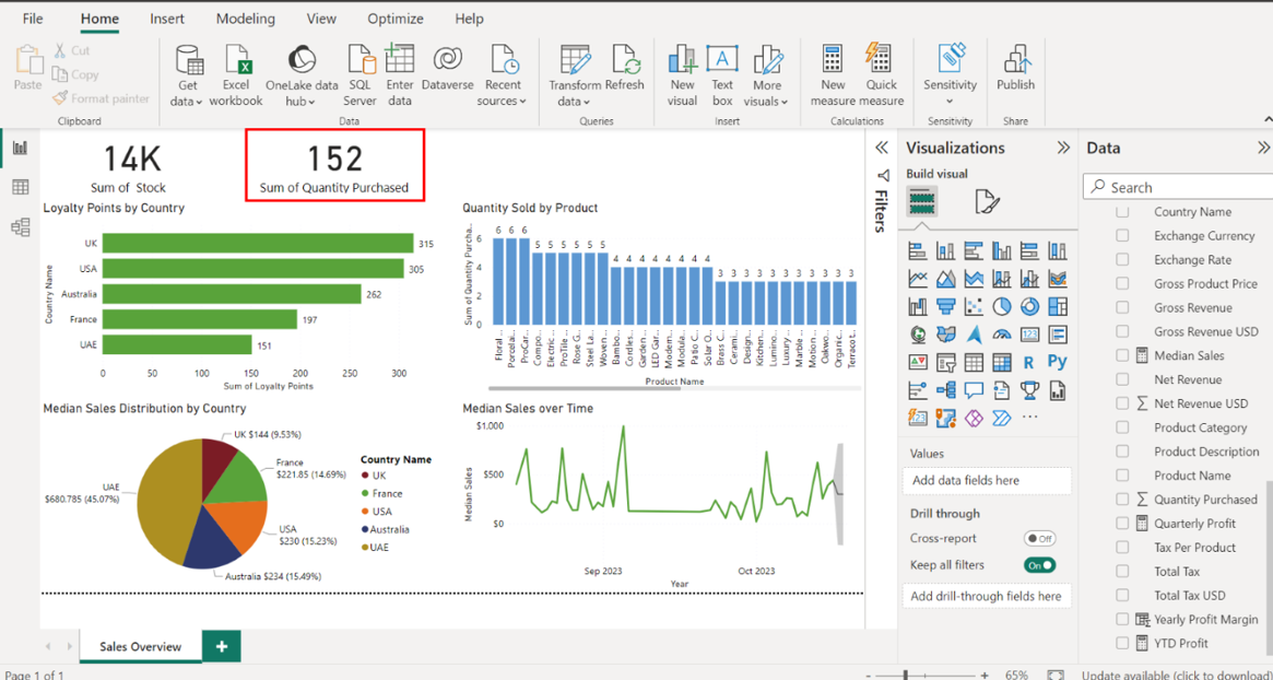
Repeat this process for the Median Sales card, placing it above the Quantity Sold by Product column chart.
Step 7: Add a slicer to the report
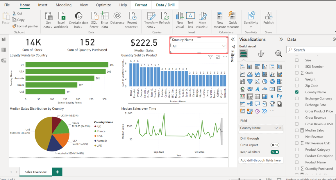
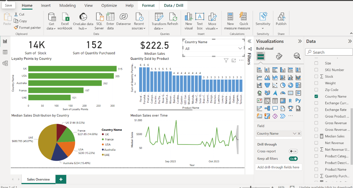
Create a slicer that displays the Country Name data from the Sales in USD table. In the Visualizations pane, select the Slicer icon and drag the Country Name field from the Sales in USD table to the Field area.
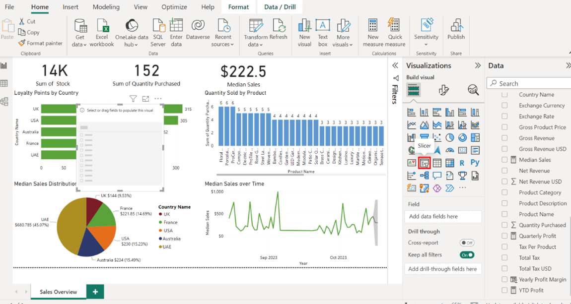
Position the slicer above the Quantity Sold by Product column chart. Select the edges of the slicer to resize it. Place it above the Quantity Sold by Product column chart.
Save your report. Select the disk icon on the top left of the window to save the report.
Create Profit Overview report
Step 1:Create Profit Overview report
Open the Sales Overview report within Power BI.
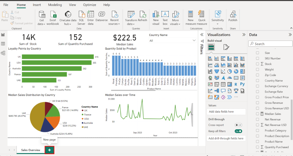
Create a new page in your existing Sales Overview report and name itProfit Overview. To add a new page, select the New Page option.
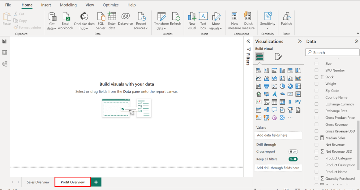
Right-click the new page, select the Rename option, and title the report Profit Overview.
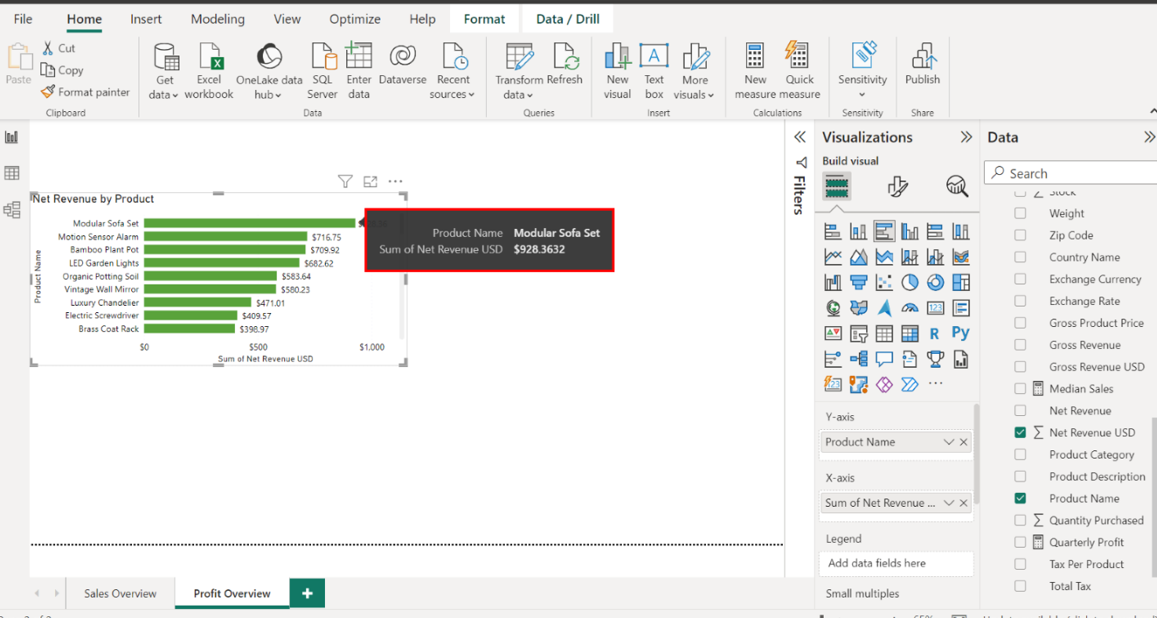
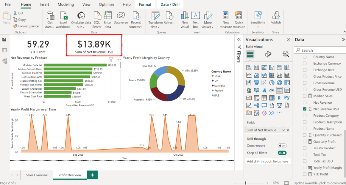
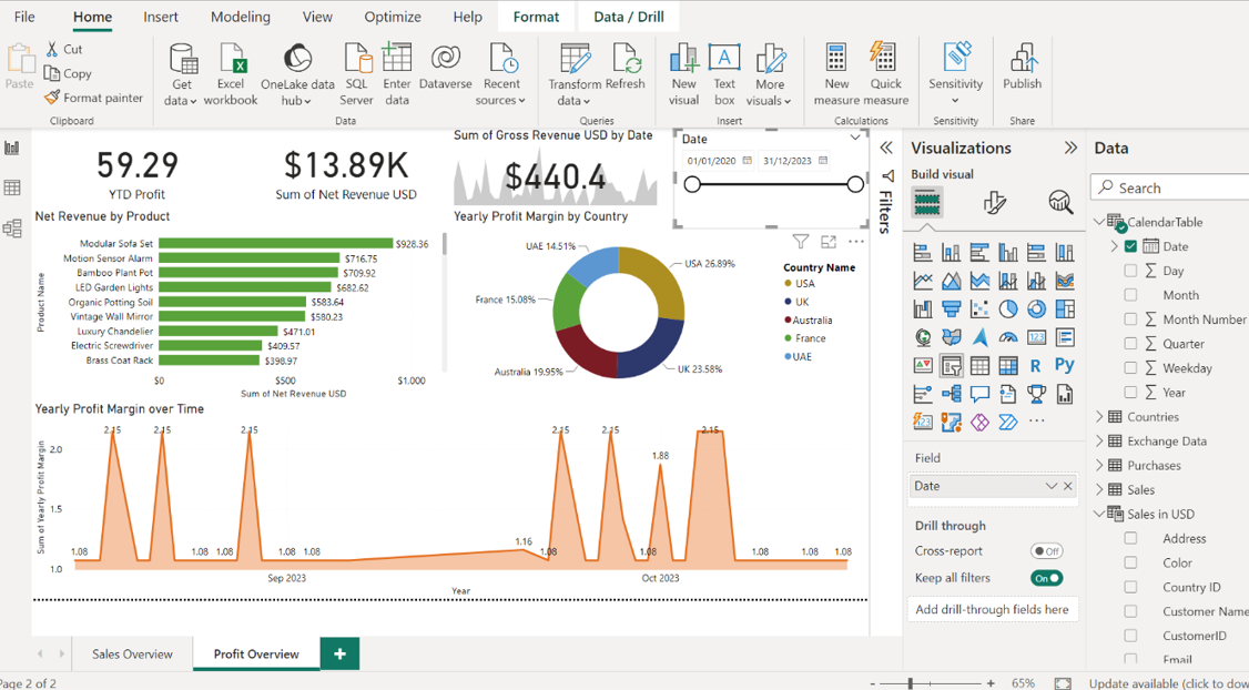
Step 2:Create a bar chart for Net Revenue by Product
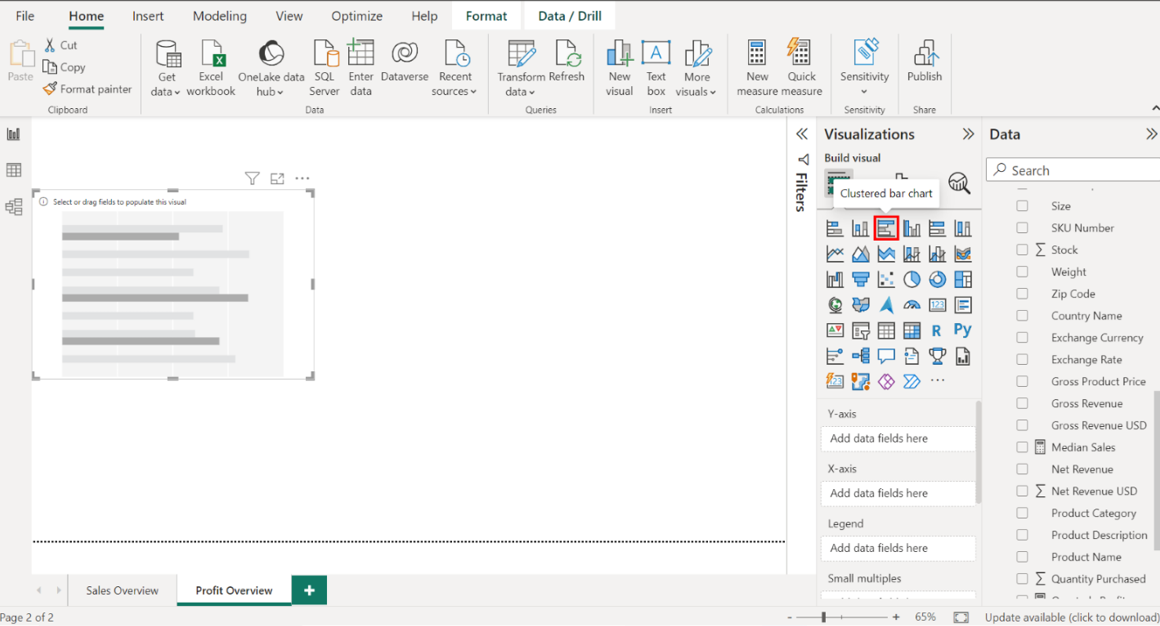
Create a clustered bar chart that visualizes Net Revenue using data from the Product Sales in USD table. Locate the Visualizations pane on the right-hand side of your screen. Select the Clustered bar chart icon to create an empty bar chart visualization on the canvas.
1. Configure the chart as follows:
• Display the Product Name on the Y-Axis.
• Display the Net Revenue USD on the X-Axis.
• Resize and position the chart to the left side of the canvas.
• Title the chart Net Revenue by Product.
• Toggle on the data labels.
Locate the Product Name table on the right-hand side of the screen. Drag the Product Name field from the Fields pane to the Y-Axis well in the Visualizations pane. Next, drag the Net Revenue USD field from the Fields pane to the X-Axis well in the Visualizations pane.
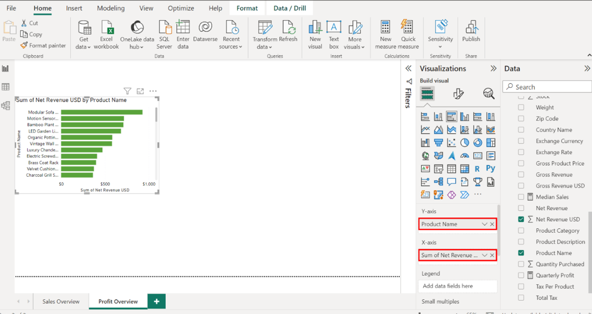
Select the edges of the visualization to resize it and place it on the left side of the canvas.
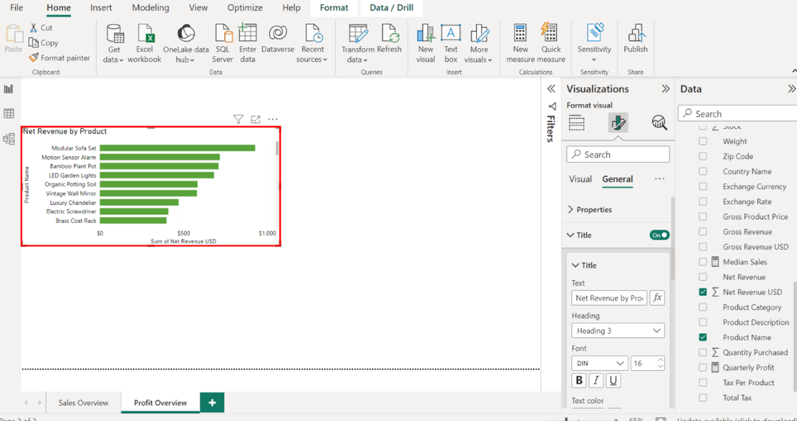
To format this visual, select the Format tab and title the chart Net Revenue by Product.
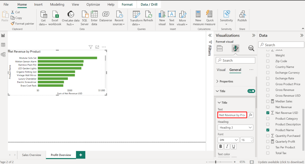
Select Data labels and toggle the switch ON to display the revenue on each bar.
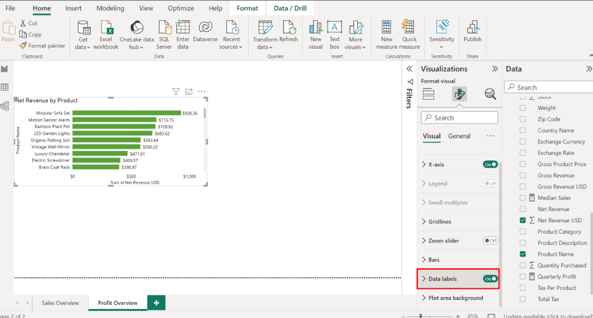
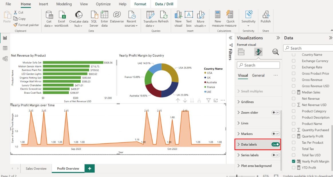
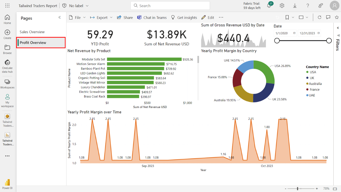
Note the product with the highest Net Revenue value. Note the product with the highest Net Revenue value: the Modular Sofa Set at 928.36 USD.
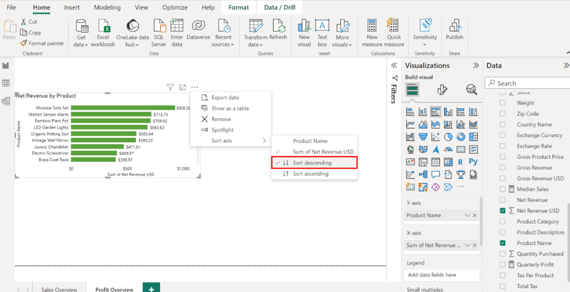
Sort the data in descending order. Select the ellipsis from the top right corner of the chart. Select the Sort Axis dropdown, then select Sort descending.
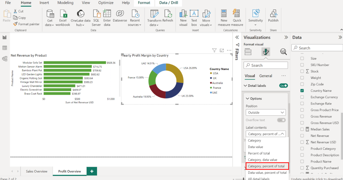
Step 3:Create a donut chart for Yearly Profit Margin by Country
Create a donut chart that visualizes Yearly Profit Margin by Country using data from the Product Sales in USD table. Select the Donut chart icon from the Visualizations pane to create an empty donut chart visualization on the canvas.
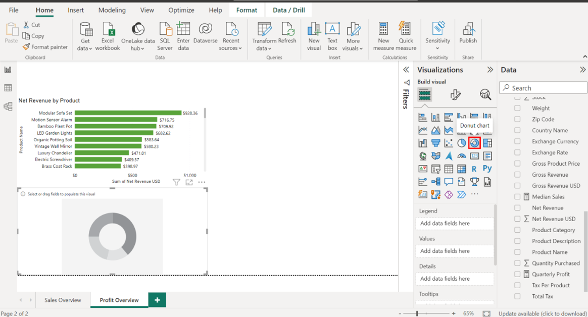
1. Configure the chart as follows:
• Display the Country Name in the Legend area.
• Display the Yearly Profit Margin in the Values area.
• Resize and position the chart to the right side of the canvas, next to the Net Revenue by Product chart.
• Title the chart Yearly Profit Margin by Country.
• Enable detailed labels for the Percent of total category.
Locate the Sales in USD table on the right-hand side of the screen and drag the Country Name field from the Fields pane to the Legend well in the Visualizations pane. Next, drag the Yearly Profit Margin field from the Fields pane to the Values well in the Visualizations pane.
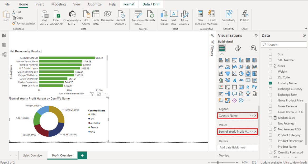
Select the edges of the visualization to resize it. Place it to the right of the Net Revenue by Product chart.
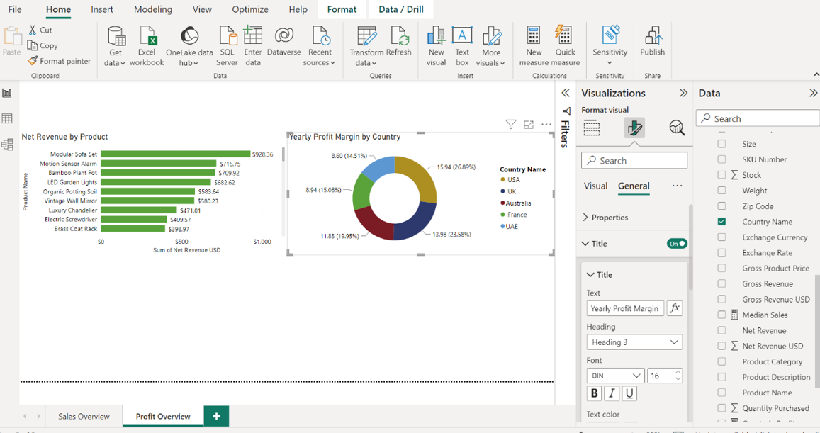
In the Format tab, title the chart Yearly Profit Margin by Country.
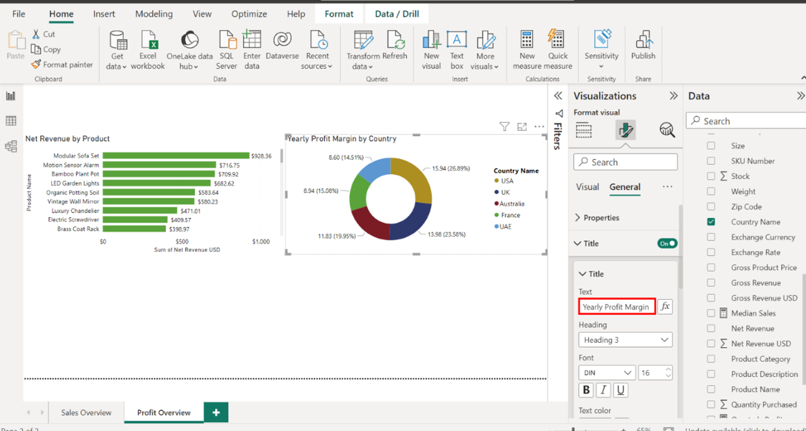
Select Detailed labels. Select Category, percent of total from the dropdown.
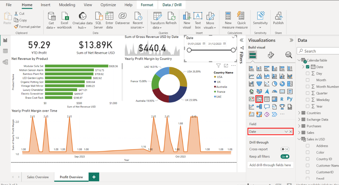
Step 4:Create an area chart for Yearly Profit Margin over Time
Create an area chart that visualizes Yearly Profit Margin over Time. Select the Area Chart icon from the Visualizations pane to create an empty area chart visualization on the canvas.
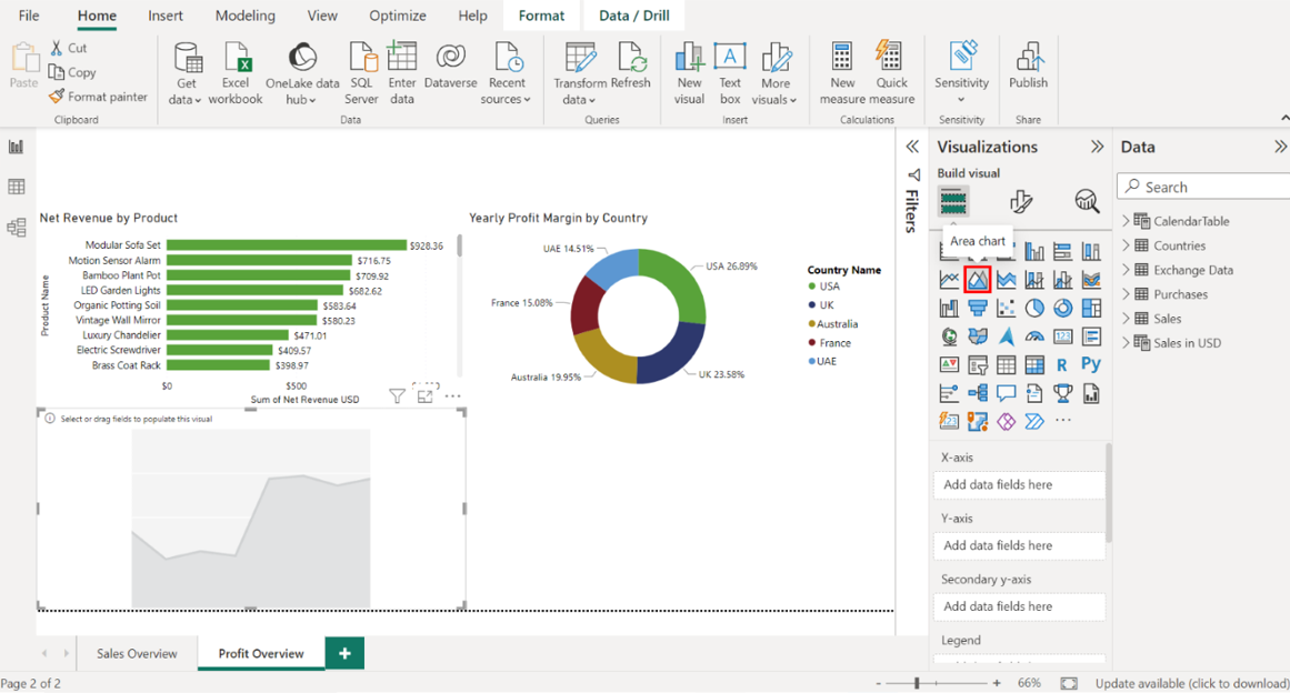
Configure the chart as follows:
• Display the Date on the Y-axis.
• Display the Yearly Profit Margin on the X-axis.
• Resize and position the chart below the Net Revenue by Productbar chart and Yearly Profit Margin by Country donut chart.
• Title the chart Yearly Profit Margin over Time.
• Toggle on the data labels.
Locate the CalendarTable on the right-hand side of the screen. Drag the Date field from the Fields pane to the X-axis well in the Visualizations pane.
Locate the Sales in USD table and drag the Yearly Profit Margin field from the Fields pane to the Y-axis well in the Visualizations pane.
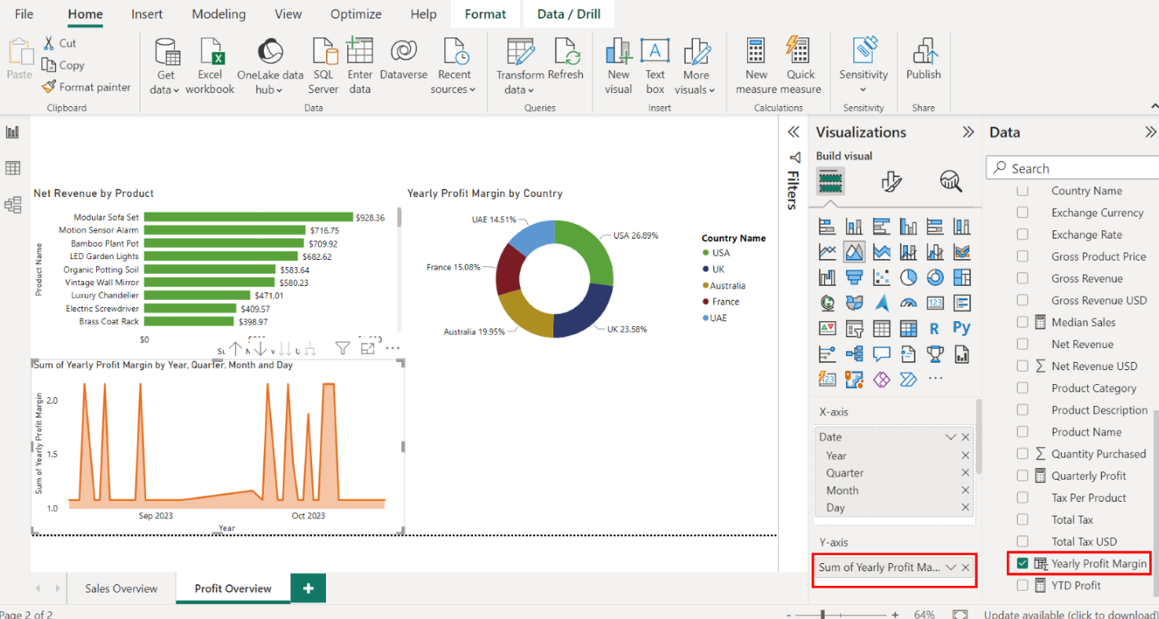
Select the edges of the visualization to resize it. Place it below the Net Revenue by Product bar chart and Yearly Profit Margin by Country donut chart.
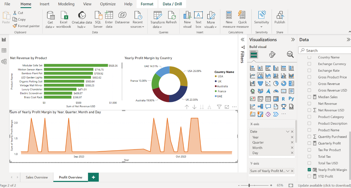
Using the Format tab, title the chart Yearly Profit Margin over Time.
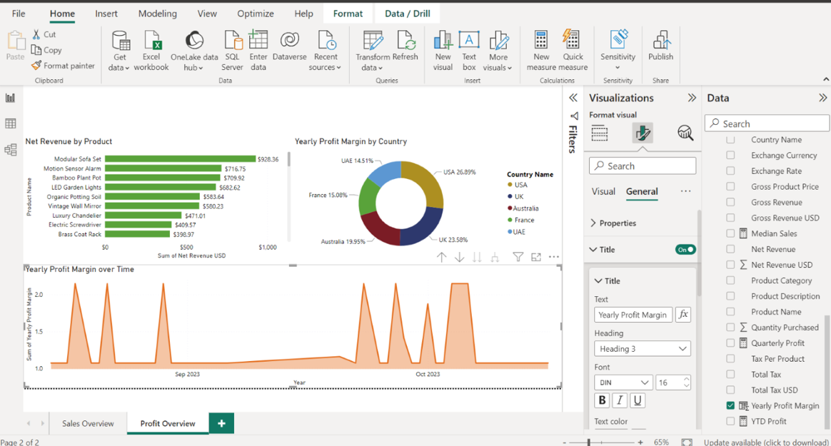
Select Data labels and toggle the switch ON to show the Yearly Profit Margin figures.
Step 5:Create an area chart for Yearly Profit Margin over Time
Create cards that visualize the following measures:
• YTD Profit
• Net Revenue USD
Position the cards above the Net Revenue by Product bar chart.
Select the Card icon in the Visualizations pane while ensuring nothing else is selected on the canvas. An empty card visual appears on the canvas.
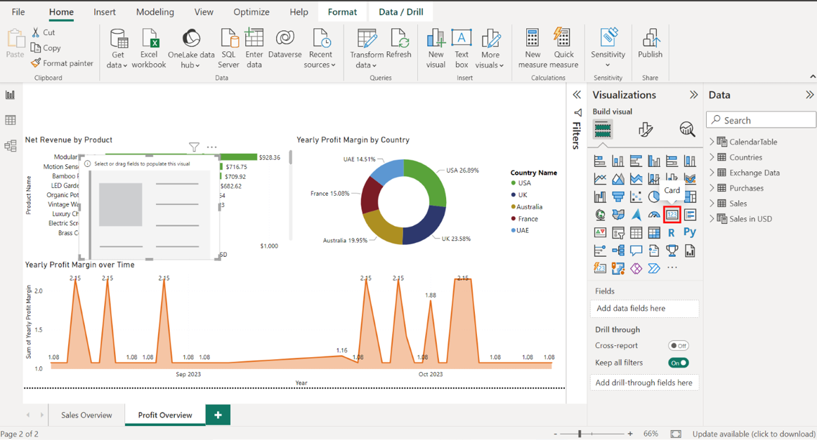
Locate the Sales in USD table and drag the YTD Profit field to the Fields well in the Visualizations pane.
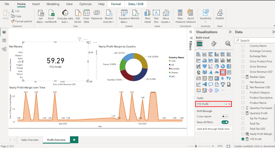
Select the edges of the card on your canvas to resize it. Place it above the Net Revenue by Product bar chart.
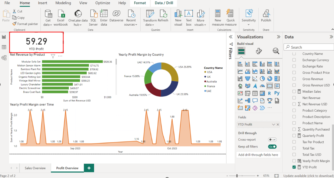
Select the Card icon in the Visualizations pane to create a second card visual for Net Revenue USD. Locate the Sales in USD table and drag the Net Revenue USD field to the Fields well in the Visualizations pane.
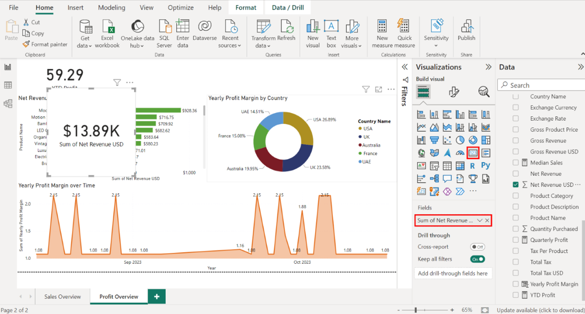
Select the edges of the card on your canvas to resize it. Place it above the Net Revenue by Product bar chart.
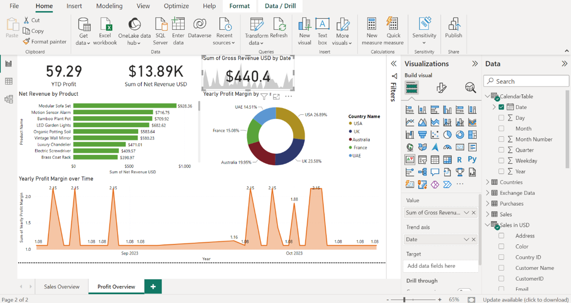
Step 6:Create a KPI for Gross Revenue USD
Create a KPI for Gross Revenue USD. Select the KPI icon in the Visualizations pane, ensuring nothing else is selected on the canvas. An empty KPI visual appears on the canvas.
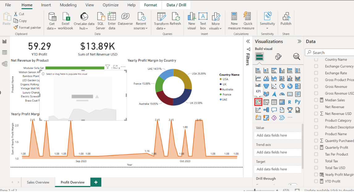
Configure the KPI as follows:
• Display the Gross Revenue USD in the value area
• Display the Date in the Trend Axis area.
• Resize and position the KPI next to the Net Revenue USD card.
Locate the Sales in USD table and drag the Gross Revenue USD field to the Value well in the Visualizations pane.
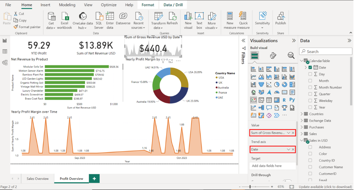
Next, locate the CalendarTable and drag the Date field to the Trend Axis well.
Select the edges of the canvas to resize it. Place it next to the Net Revenue USD card.
Step 6:Create a KPI for Gross Revenue USD
Create a slicer that displays the Datedata from the CalendarTable table. In the Visualizations pane, select the Slicer icon.

Drag the Date field from the CalendarTable to the Field area.
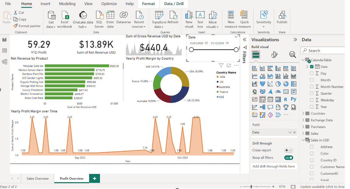
Select the edges of the Slicer to resize it. Place it next to the Gross Revenue USD KPI.
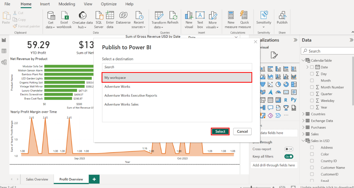
Save and publish report. Select File in the top-left corner of the Power BI Desktop interface, and then Save to save the report. In the dialog box, indicate where to save the report. Select My Workspace as your workspace and then the Select button.
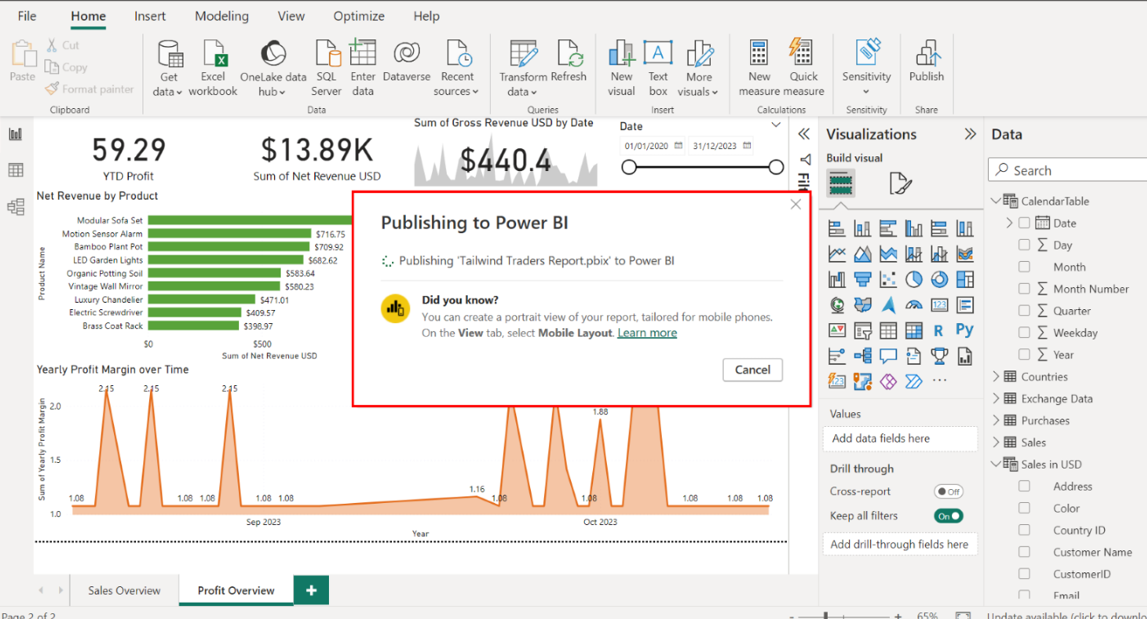
Once the destination is selected, Power BI publishes the report. Depending on the size of the report and your internet connection, this process could take a few moments.
Once the report is published, a new window appears to confirm successful publication. It provides two options:
• Open the report in Power BI Service
• Or Cancel and open it later.
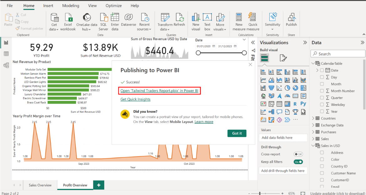
In this case, select Open to launch the default web browser on your computer and view your report in Power BI service.
Conclusion
With these steps, I have successfully configured aggregations using DAX, and generated insights from the data I used to create sales and profit reports.
Milestone 3: Create Dashboard and Configure Alerts
Overview
In the third and final set of Capstone project exercises, I helped Tailwind Traders create a dashboard in which you could upload the reports you generated and configure the dashboard, so it notified the company in the form of alerts and subscriptions.
• Create an executive dashboard.
• And configuring alerts and subscriptions.
This reading provides a step-by-step guide for completing these tasks. It also includes screenshots that you can compare against your work.
Creating an Executive Dashboard
Step 1: Create a new dashboard named Tailwind Traders Executive Dashboard.
Navigate to your workspace and create a new dashboard called Tailwind Traders Executive Dashboard. In the Navigation view of My Workspace, locate and select the + New button on the top left corner of the screen.
Select Dashboard from the list of options.
A pop-up window titled Create a dashboard appears. Type Tailwind Traders Executive Dashboard in the Name field.
Select Create. This action creates a new dashboard shell to which you can add content.
Step 2: Pin Sales Overview core Visualizations.
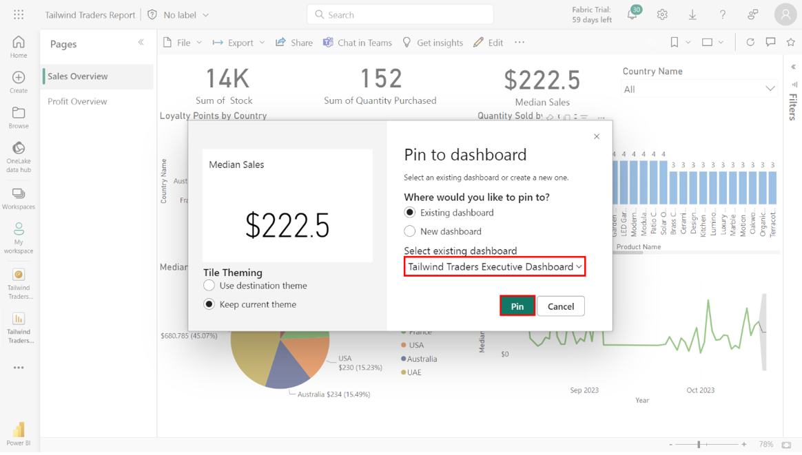
Navigate to your Workspace and access the Sales Overview tab of the Tailwind Traders Report. On the left side of your Power BI service screen, locate and select Workspaces > My Workspace again.
Navigate to the Tailwind Traders Report in the list of reports within the workspace. Select the report’s Sales Overview tab.
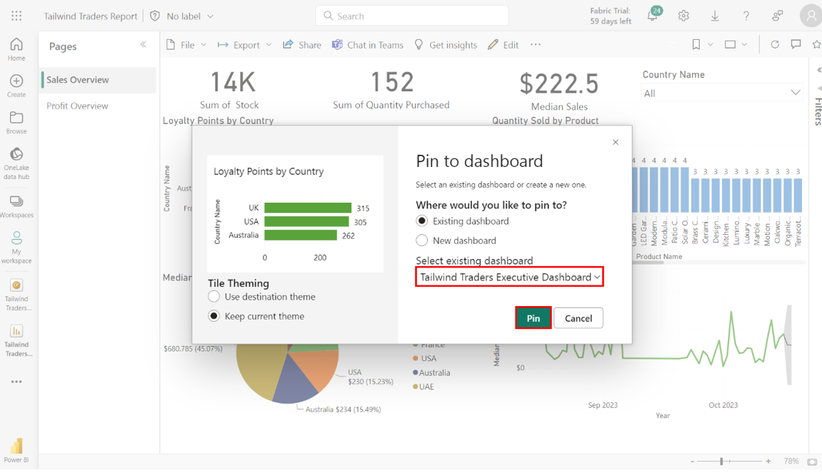
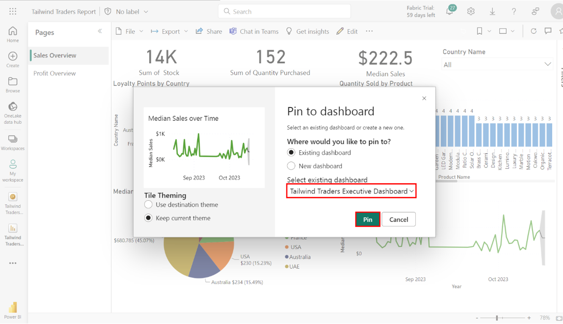
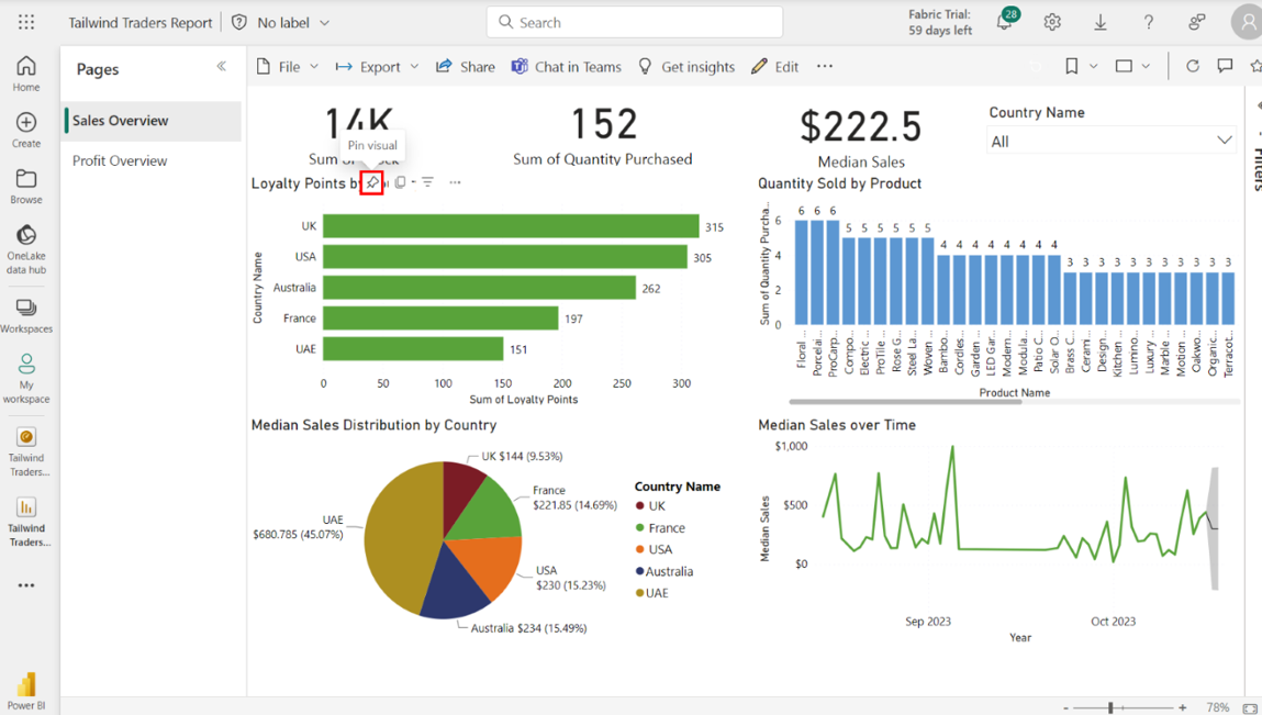
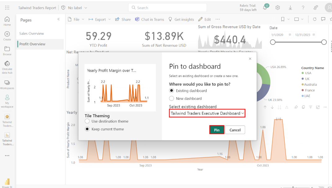
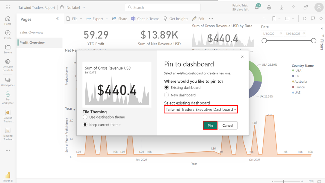
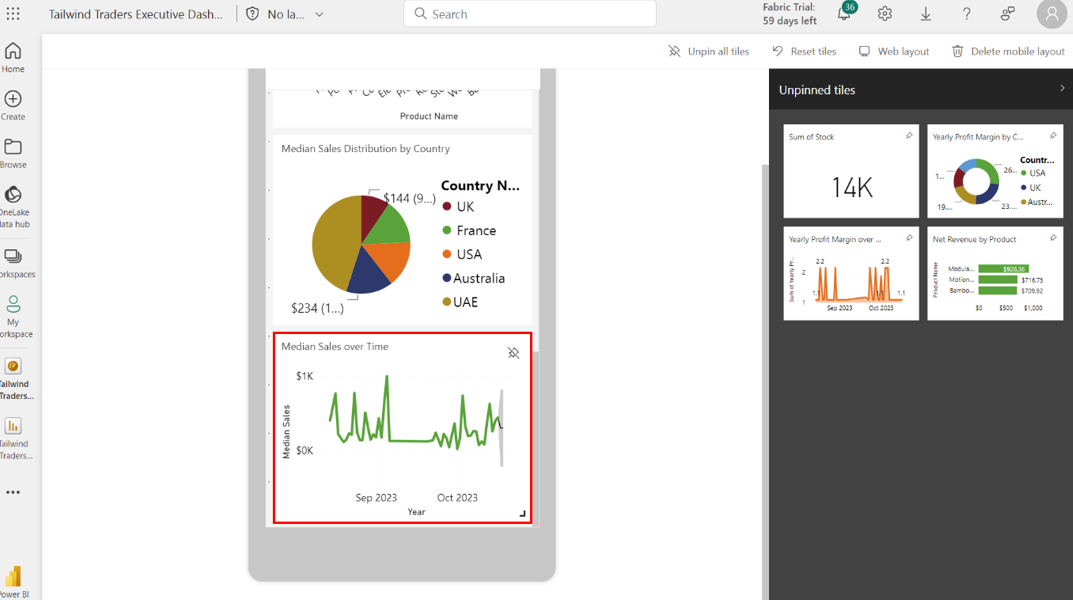
Within this tab, locate and select the pin icon on the Loyalty Points by Country bar chart. A Pin to dashboard dialog box appears onscreen. Select the Tailwind Traders Executive Dashboard and select Pin to confirm your choice.
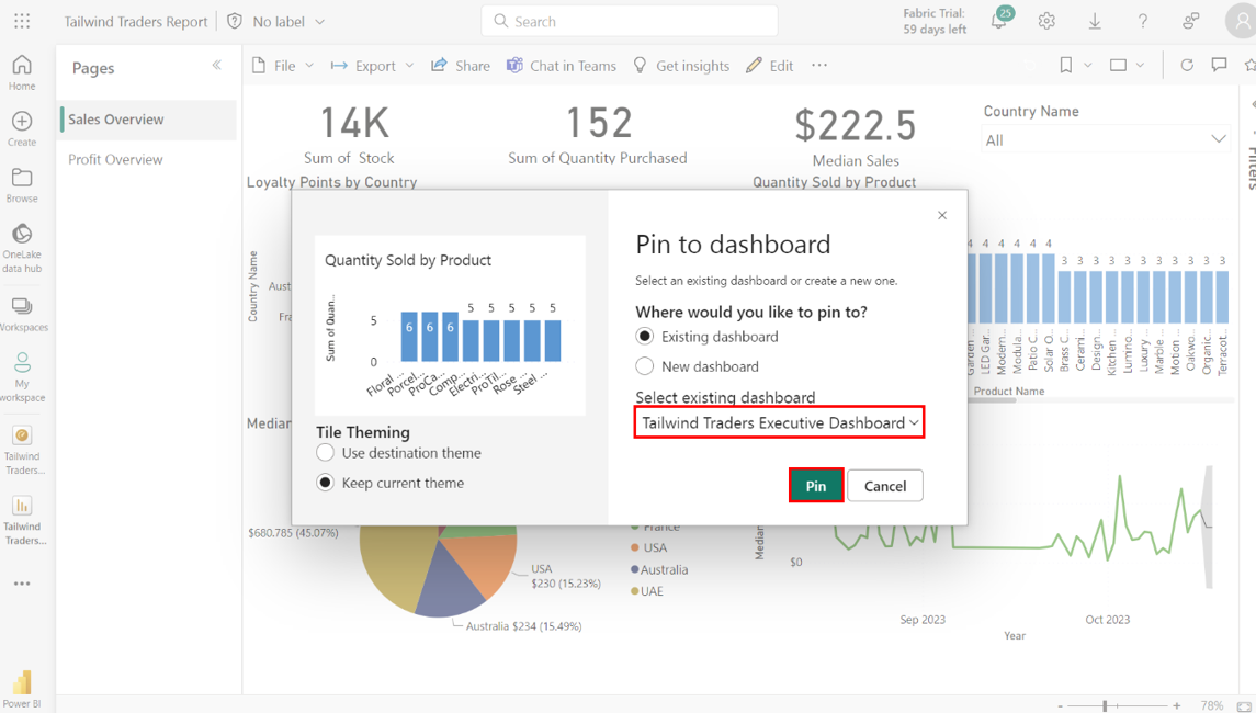
Repeat this action for the following charts:
Quantity Sold by Product column chart.
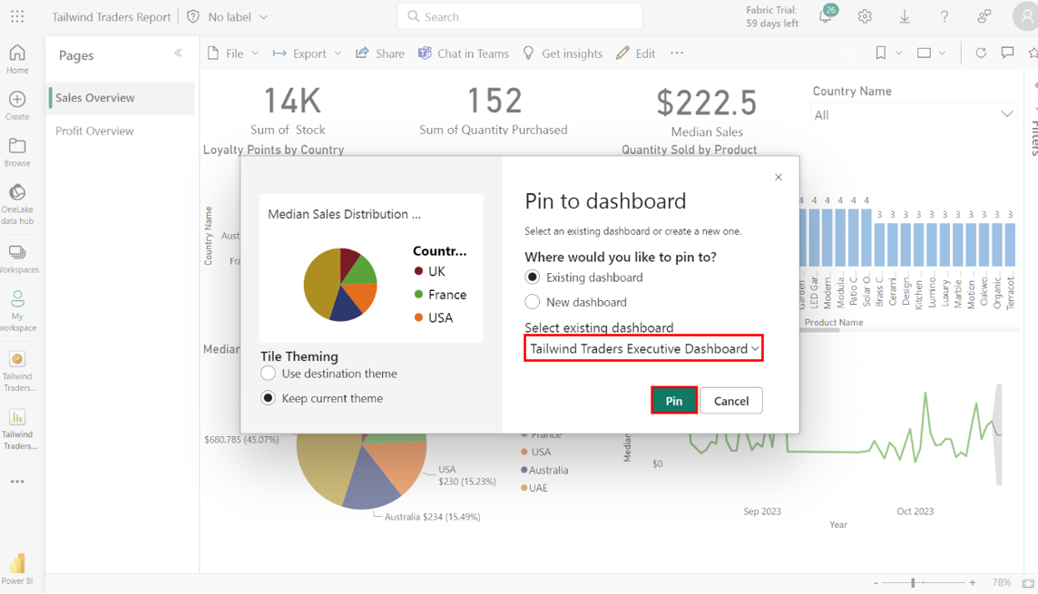
Median Sales Distribution by Country pie chart.
Media Sales Over Time line chart.
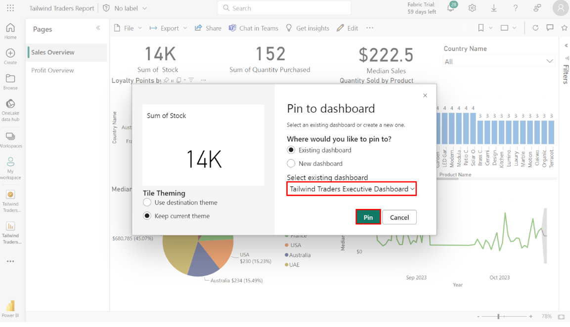
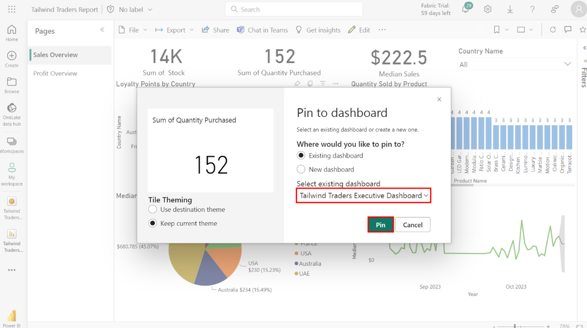
Step 3: Pin the Sales Overview card visualizations
1. Locate and pin the following Sales Overview card visualizations to the Tailwind Traders dashboard:
• Sum of Stock card
• Sum of Quantity Purchasedcard
• Median sales card
Select the pin icon on the Sum of Stock card.
Pin the card to the Tailwind Traders Executive Dashboard.
Repeat this process for the Sum of Quantity Purchased card.
Repeat this process once again for the Median Sales card.
Step 4: Pin the Profit Overview core visualizations
Select the Profit Overview tab. Select the Profit Overview tab from the Tailwind Traders Report
Locate and pin the following Profit Overview core visualization to the Tailwind Traders Executive Dashboard:
• Net Revenue by Product bar chart
• Yearly Profit Margin by Country donut chart
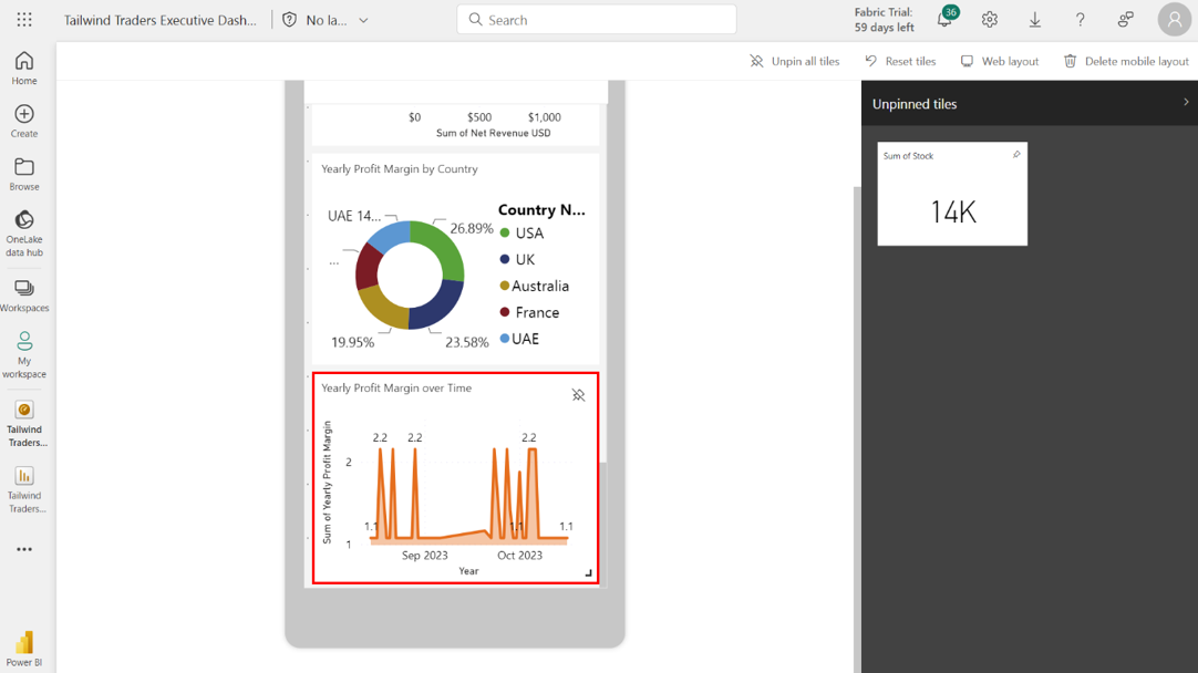
• Year Profit Margin over Time area chart
Select the pin icon on the Net Revenue by Productbar chart and pin the visualization to the Tailwind Traders Executive Dashboard.
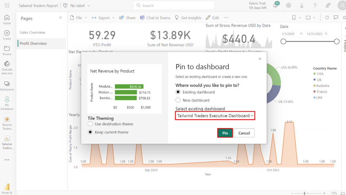
Repeat this process for the Yearly Profit Margin by Country donut chart.
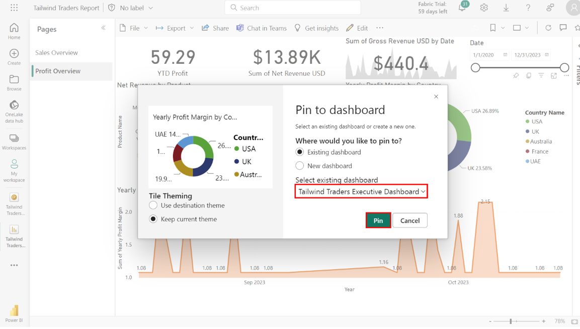
Repeat the process for the Year profit Margin Over Time area chart.
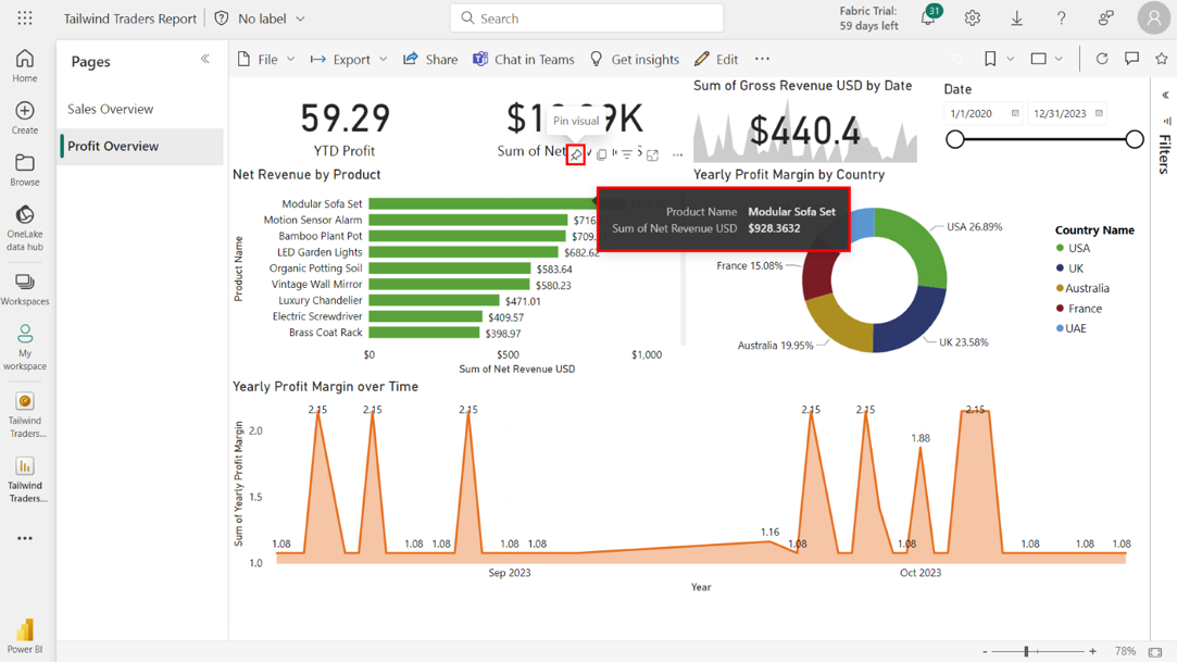
Note the product with the highest value in the Net Revenue by Product bar chart. The Modular Sofa Set has the highest Sum of Net Revenue USD, which is precisely 928.36.
>
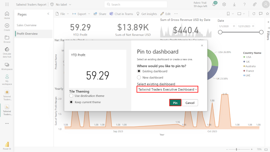
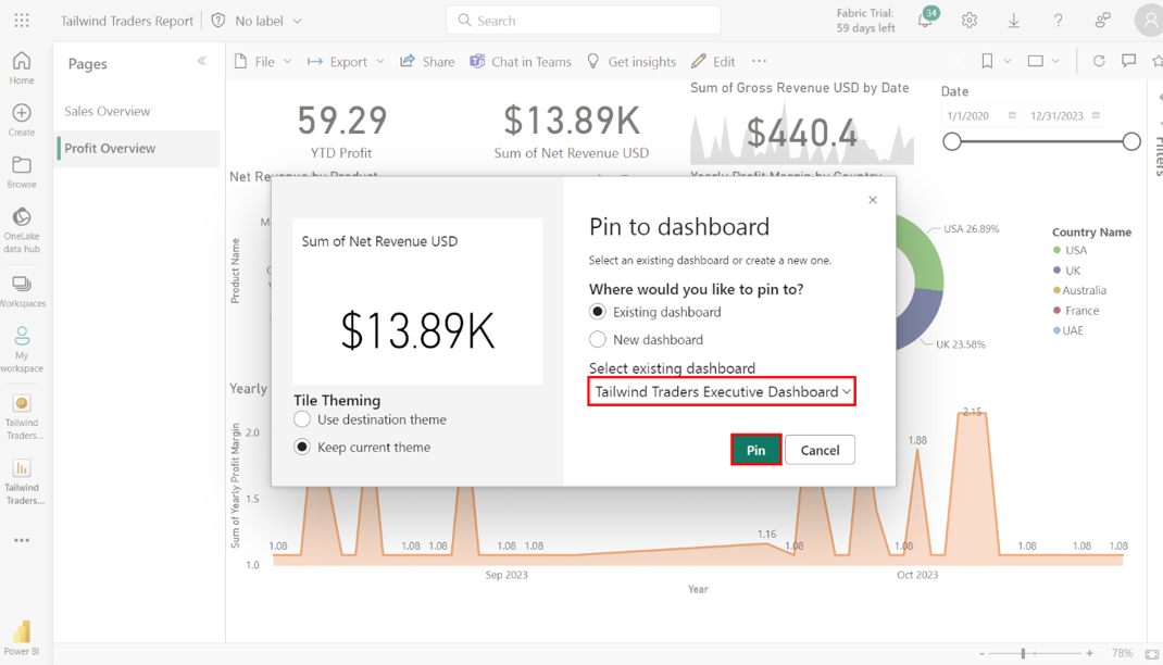
Step 5: Pin Profit Overview Card and KPI Visualizations
Locate and pin the following items to the Tailwind Traders Executive Dashboard:
• YTD Profit card
• Sum of Net Revenue USD card
• Sum of Gross Revenue USD KPI
Select and pin the YTD Profit Card to the Tailwind Traders Executive Dashboard.
Repeat these actions for the Sum of Net Revenue USD Card.
Repeat these actions for the Sum of Gross Revenue USD KPI.
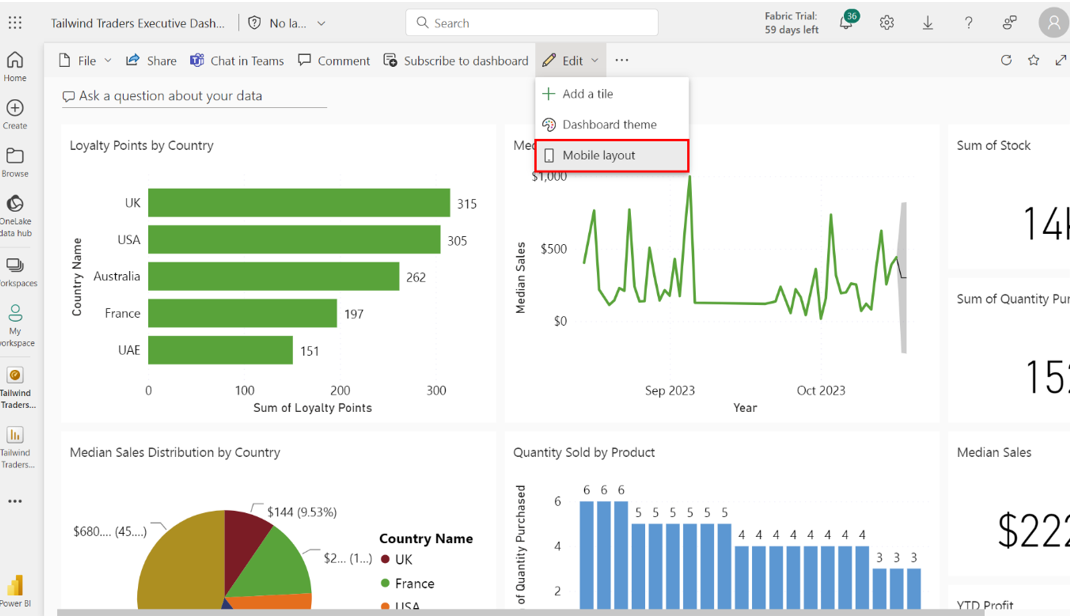
Step 6:Configure the Mobile View for the cards and KPI visuals
Locate and select the Tailwind Traders Executive Dashboard from the Dashboards list. Select Workspaces, then My Workspace. Select the Tailwind Traders Executive Dashboard from the list of dashboards within the workspace
Select Mobile Layout from the Edit menu and pin your card visuals to the dashboard in the following order:
• Sum of Net Revenue USD to the left and Sum of Quantity Purchased cards to the right.
• Median Sales to the left and YTD Profit cards to the right.
• Sum of Gross Revenue USD KPI across the full width of the layout
Select Edit from the main navigation bar. Select Mobile layout from the list of options to switch the view from desktop to mobile.
Once you select the Mobile layout, your screen adjusts to a vertical layout to replicate a mobile device's screen size. This canvas is blank. You must decide which visuals to show on the mobile layout and where to place them. A list of all the visualizations in your dashboard is displayed on the right side of your screen. Each visualization has a pin icon next to it.
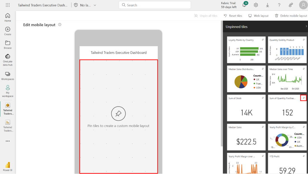
Select the Pin icon for the Sum of Net Revenue USD and Sum of Quantity Purchased cards. Arrange the card visuals on the mobile canvas side-by-side for a balanced look.
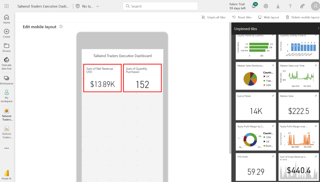
Repeat this process for the Median Sales Card and YTD Profit Card. Finally, pin the Sum of Gross Revenue USD KPI so that it’s the full width of the layout of the mobile canvas.
Step 7:Configure the Mobile View for the core visualizations
Configure the mobile view for the core visualizations by pinning the Sales Overview visualizations in the following order:
• Loyalty Points by Country bar chart
• Quantity Sold by Product column chart
• Median Sales Distribution by Country pie chart
• Median Sales over Time line chart
Select the Pin icon for the Loyalty Points by Country bar chart to pin it to the mobile view. Repeat this process for the Quantity Sold by Product column chart.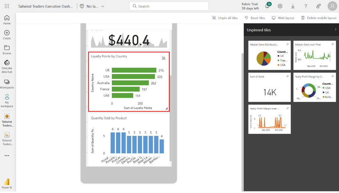
Repeat this process for the Median Sales Distribution by Country pie chart and Median Sales over Time line chart.
Pin the following Profit Overview visualizations in the following order:
• Net Revenue by Product bar chart
• Yearly Profit Margin by Country donut chart
• Yearly Profit Margin over Time area chart
Select the Pin icons for the Net Revenue by Product bar chart and Yearly Profit Margin by Country bar chart.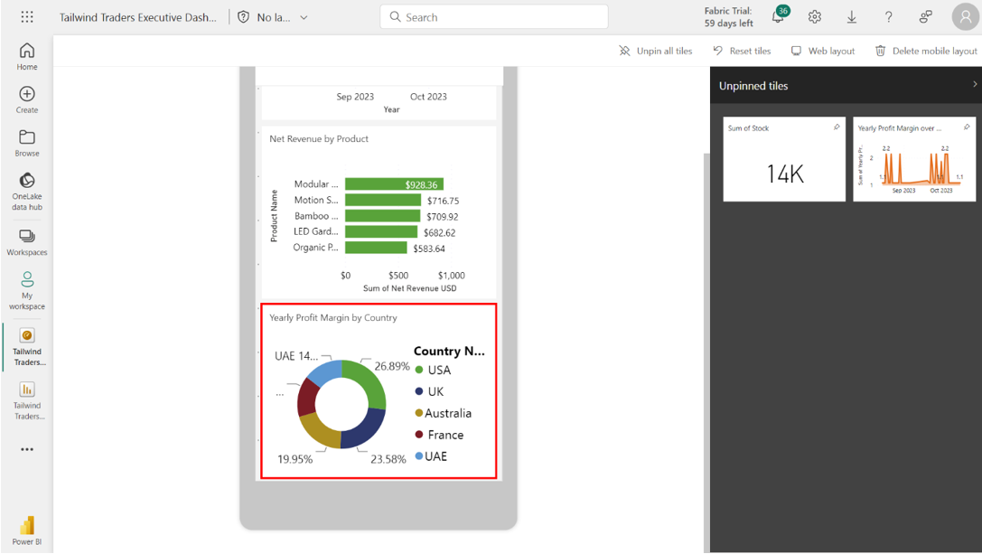
Pin the Yearly Profit Margin over Time area chart.
Configuring Alerts and Subscriptions
Step 1: Create daily alerts for key metrics such as Gross Revenue USD.
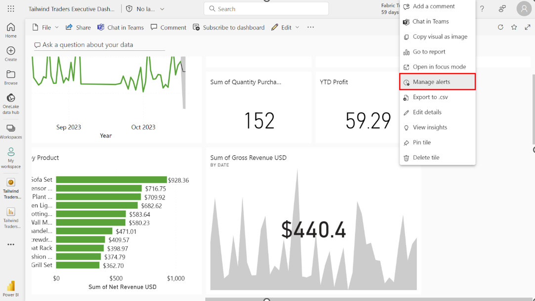
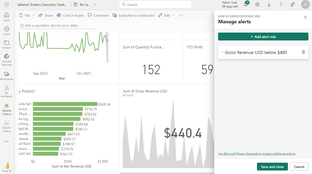
Access the Mange Alerts menu for the Sum of Gross Revenue USD KPI tile. On the Tailwind Traders Executive Dashboard, locate the Sum of Gross Revenue USD KPI tile and select the ellipses icon.
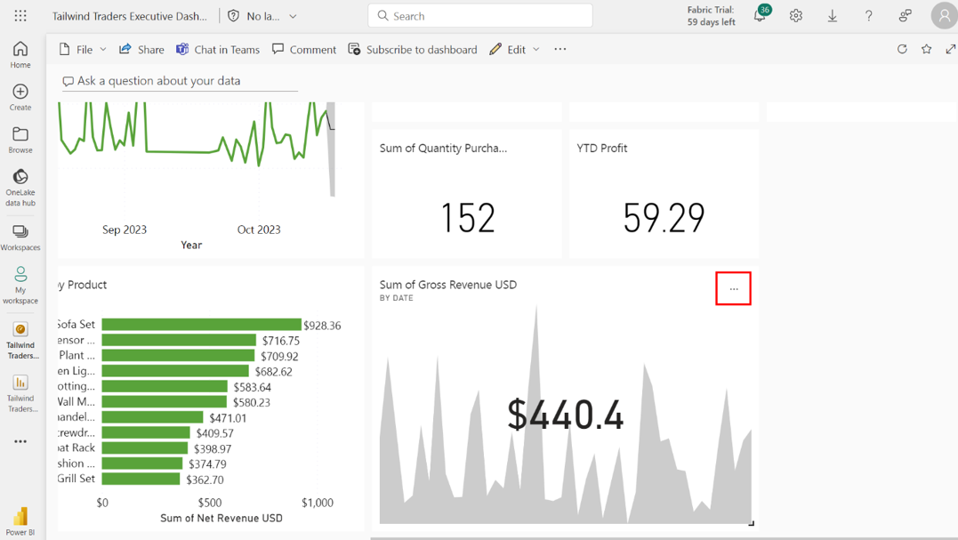
Select Manage alerts from the list of options that appear.
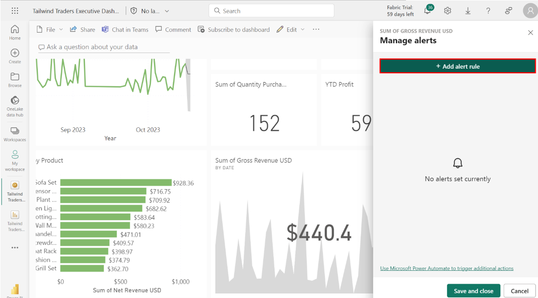
Create a new alert titled Gross Revenue USD below $400 with the following configurations:
• In the Condition section, set the threshold at $400.
• Set a frequency of at most every 24 hours.
Within the Manage alerts screen, locate and select + New alert rule.
Enter Gross Revenue USD below $400 in the Alert title field.
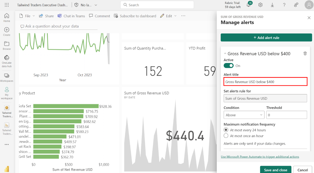
In the Condition section, locate the dropdown menu and select Below. In the adjacent field, type in 400 to set the threshold at $400.Navigate to the Frequency section to decide how often Power BI checks this condition. For critical metrics, like Sum of Gross Revenue USD that might require daily checks, selecting the At most every 24 hours setting is appropriate.
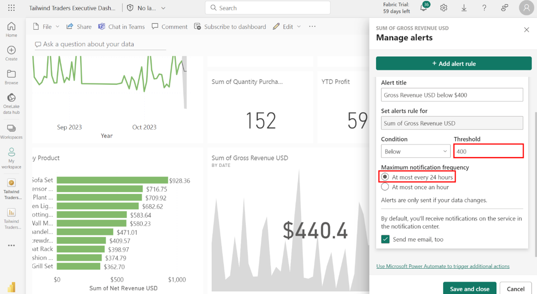
Save and close the alert. Once you’ve set all required parameters, select Save and close to save your alert settings and activate the alert rule.
Step 2: Create subscriptions for Sales Overview and Profit Overview reports with specified configurations.
Access the report’s Sales Overview tab. Locate and select Workspaces, then My Workspace. Find and select the Tailwind Traders Report in the list of reports within the workspace.
Access the Median Sales Distribution by Country pie chart and note down the country with the highest Median Sales value. Select the Median Sales Distribution by Country pie chart from the canvas. UAE is the country with the highest Median Sales, measuring 680.785 USD.
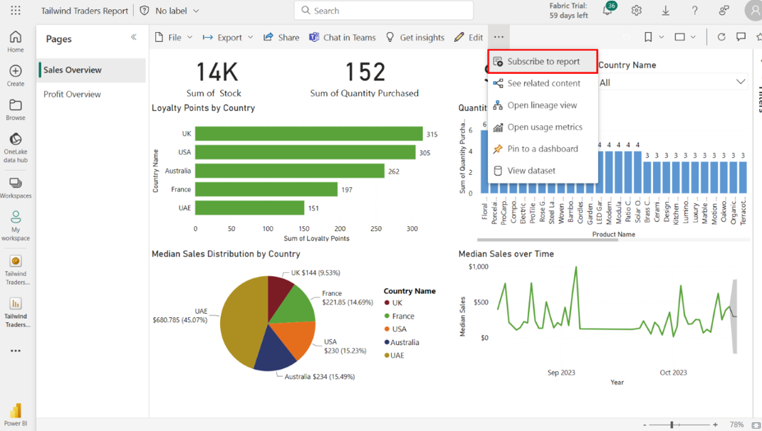
Create a subscription for the Sales Overview report with the following configurations: Select the ellipses next to the Edit button. Select Subscribe from the list of options that appears.
This action opens the Subscription pane. Name your subscription Sales Weekly Summary.
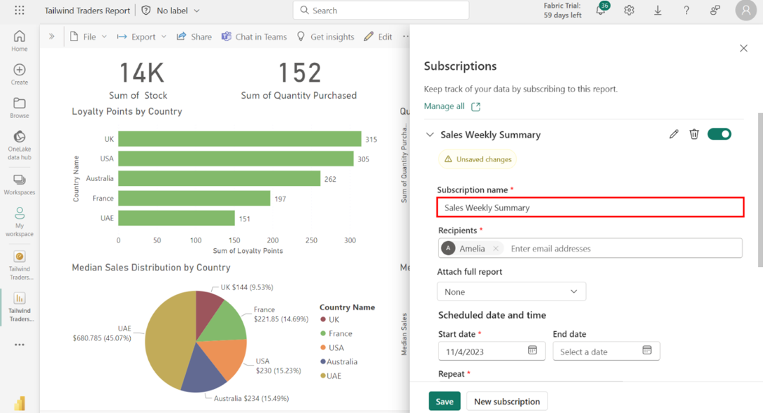
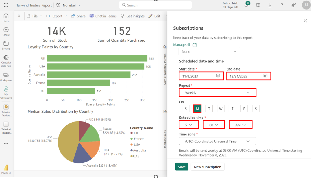
Set the Start date to the current date and the End date to 12/31/2025. For the frequency, select Weekly and select Monday. Set the Scheduled time to 5:00 AM.
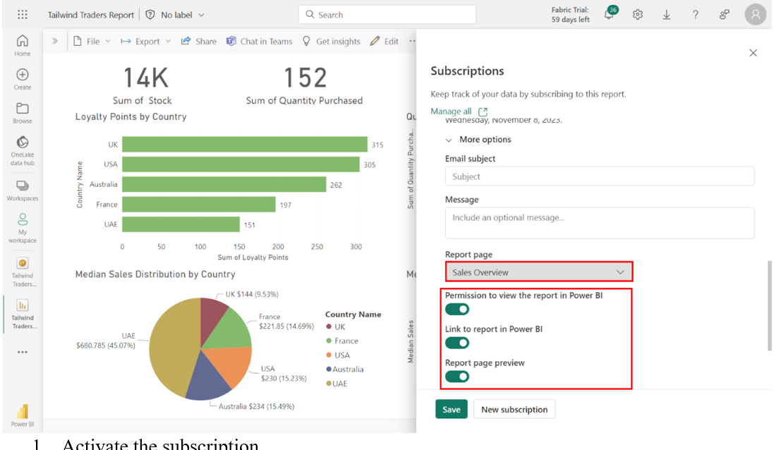
Access the Sales Overview report page in the Report page dropdown and ensure that the toggle switches for the following options are activated:
• Permission to view the report in Power BI
• Link to report in Power BI
• Report page preview
Expand More options to view the Report page dropdown. Select the Sales Overview report page from the dropdown. Check that the toggle for each of the following options is activated:
• Permission to view the report in Power BI
• Link to report in Power BI
• Report page preview
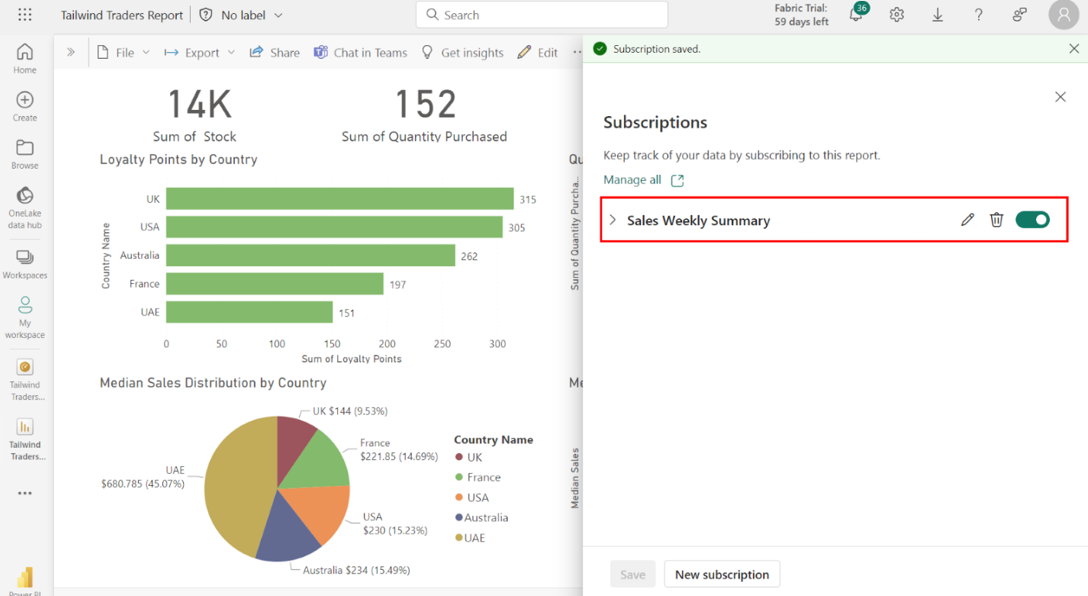
Activate the subscription. Select Save to activate the Sales Overview subscription. You’ll receive a message confirming your subscription is now active.
Repeat the same process for profit overview
Conclusion
With these steps, the Executive sales project successfully demonstrated the preparation, configuration, and analysis of sales data, creation of insightful reports, and development of an executive dashboard with alerts and subscriptions.